Rain, rain, go away, I've got a flood today

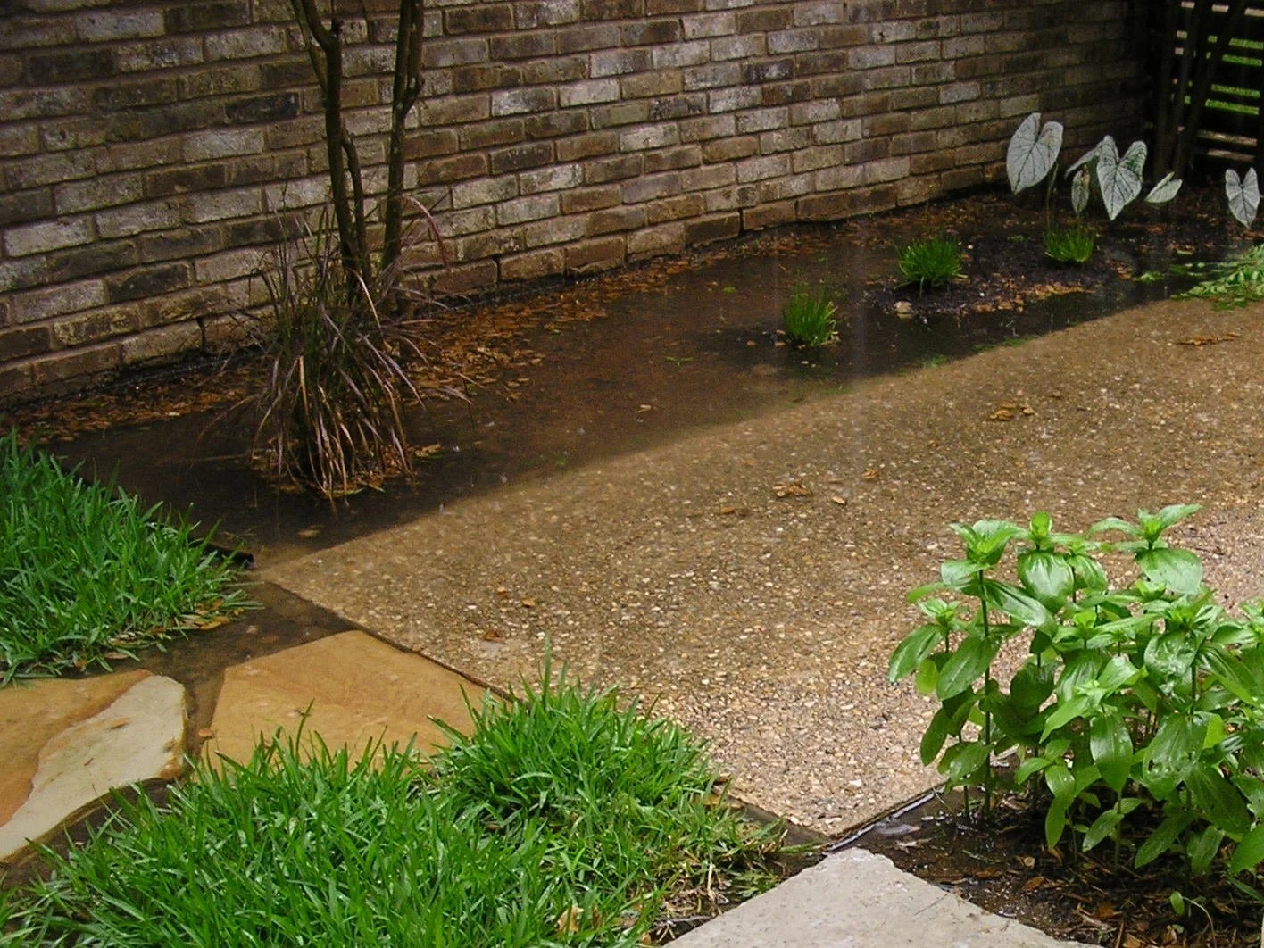
It has been raining cats and dogs over the past couple of weeks in Austin, totaling 9.8" of rainfall just in the Bull Creek watershed. Last Tuesday, we got 4.76" of rainfall. That is about how much is normal average for the entire month of May, our wettest month.  And it all came down overnight.  All the low water crossings in the belly of the watershed were flooded, with water gushing over the roads for well over 24 hours. I regularly check http://www.atxfloods.com/ for updates.

I love the rain. I love the bright green clean look that is a result of a good shower. I love cloudy days as much as I love blue skies.  After the drought we've had since 2011, you probably love it too.  And if you harvest rainwater as your sole source of water supply, you are probably jumping with joy, singing "let it rain". But if your site has drainage issues, you are probably worried, and thinking "rain, rain, go away". Whether it is a flat lot or there is topography (i.e. slope, as is common in some parts of Austin and the hill country), site water management is critical for the building's durability and worry-free home-ownership.

I used to worry. My first house was a garden-home with a yard that had all the right ingredients for a flooding recipe.  It was built in the late 70's in a zero-lot-line development, after the whole area was razed to the ground and compacted with caliche (crushed limestone). Although a good base for roads and driveways, and a cheap stabilizer for concrete foundation, caliche is bad for ground water seepage. (And gardening! Hardly ideal for a garden house!  The yard had about 4"-6" of soil before you hit caliche. Needless to say, it wasn't a very lush garden. Or you had to work hard for it. Of course, many trees and hardy plants have grown in the neighborhood over the last 30 years.)  Adding to the nonporous nature of the soil, the yard was flat as a pancake, and locked in between adjacent houses and their yards.  Hint: A depressed, flat, impervious area, bound on all sides is sometimes called a pond!  Let me just say, after having owned this house, "courtyards" have lost all their appeal.

When it rained, all the water from my roof and the neighbors' roofs would pour into the yard. Roof runoff was (and almost always is) by far the biggest contributor of water.  Runoff from the patio and entry walkway was the second. All this water would collect in my "pond" to a depth of 6" to 8" and then start creeping into my garage, and soon after, my neighbor's house.  You see, the lawn in front of the entry gate created a small berm, that trapped the water in the yard, preventing it from draining into the street. The whole neighborhood has grading and drainage issues. In a really heavy downpour, the cul-de-sac would collect so much storm-water that the street gutters would fill up to the curb and flood the sidewalk.

I had to fix it.

Our HOA (Home Owner's Association) wanted us to build a concrete flume along the side of the property.  In my estimation, the flume would only serve as a ditch for water to collect and stagnate against the neighbor’s foundation till the rain subsided. This was the only predictable outcome as the elevation of the flume would be lower than that of adjacent grade and the street it was supposed to drain towards.

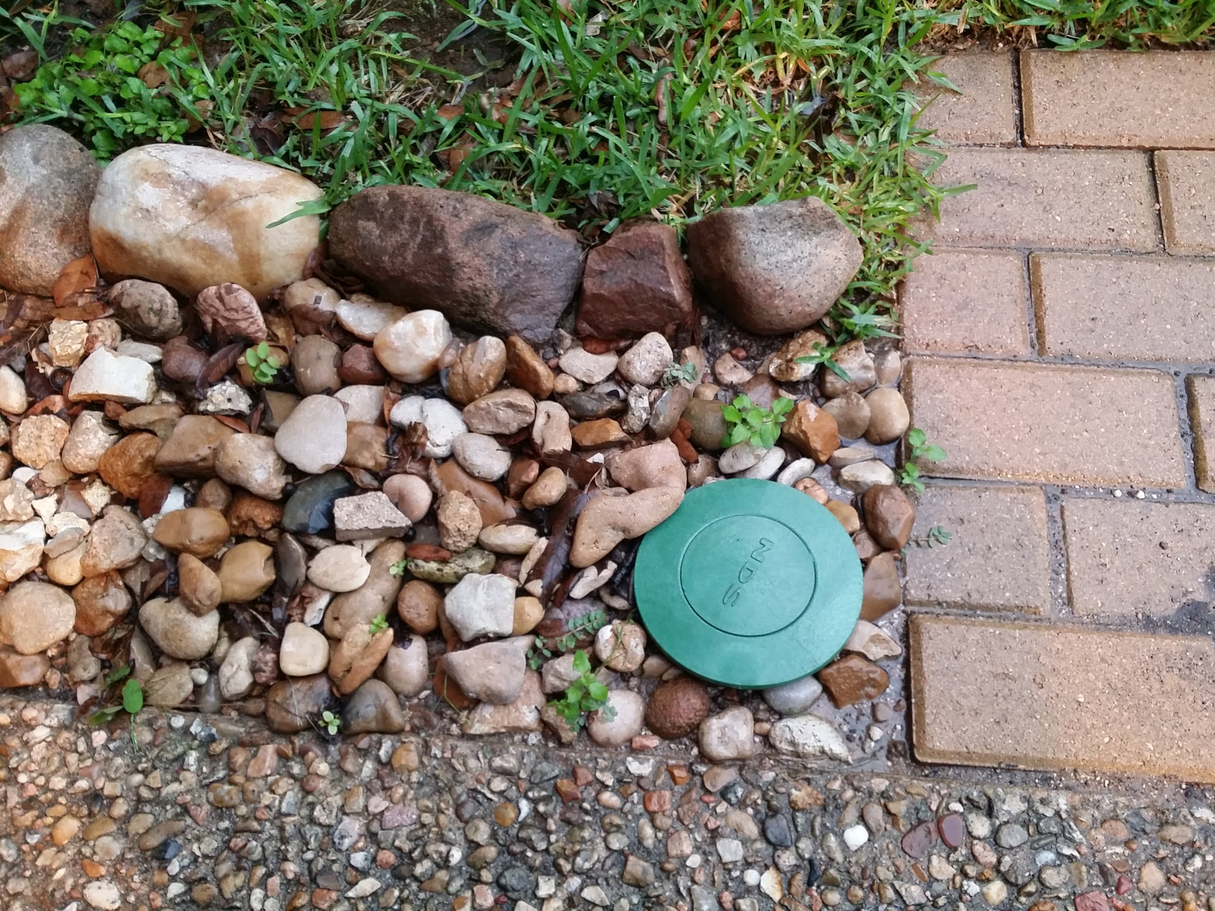
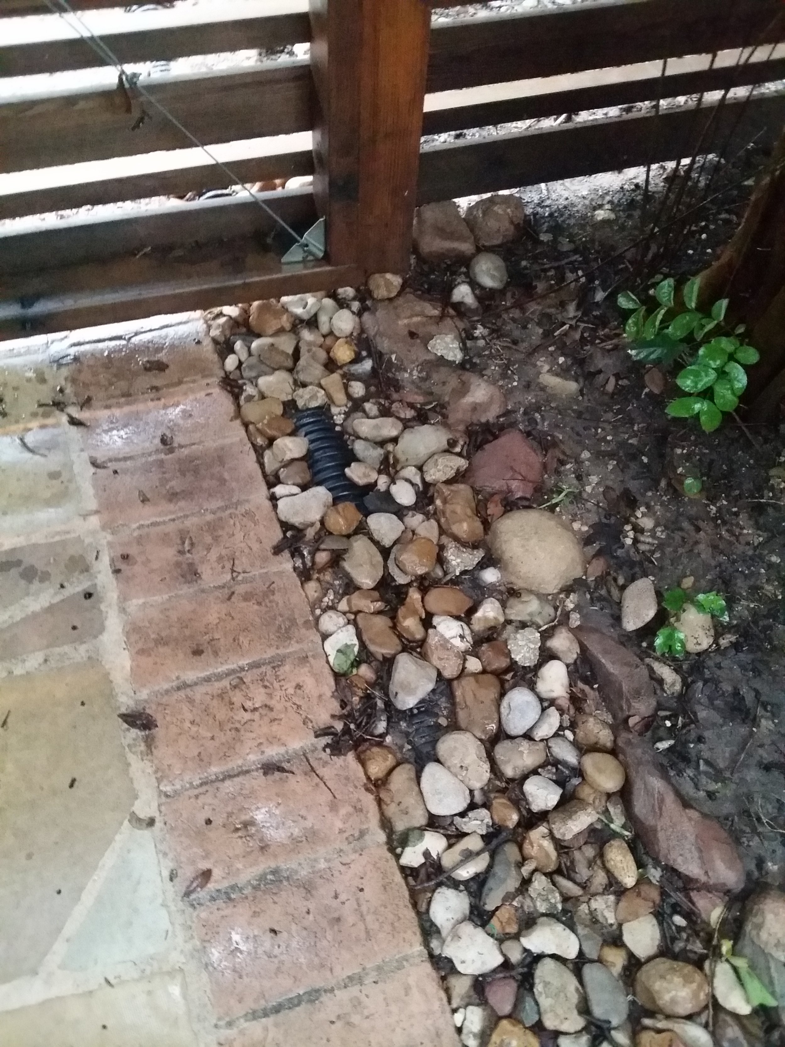
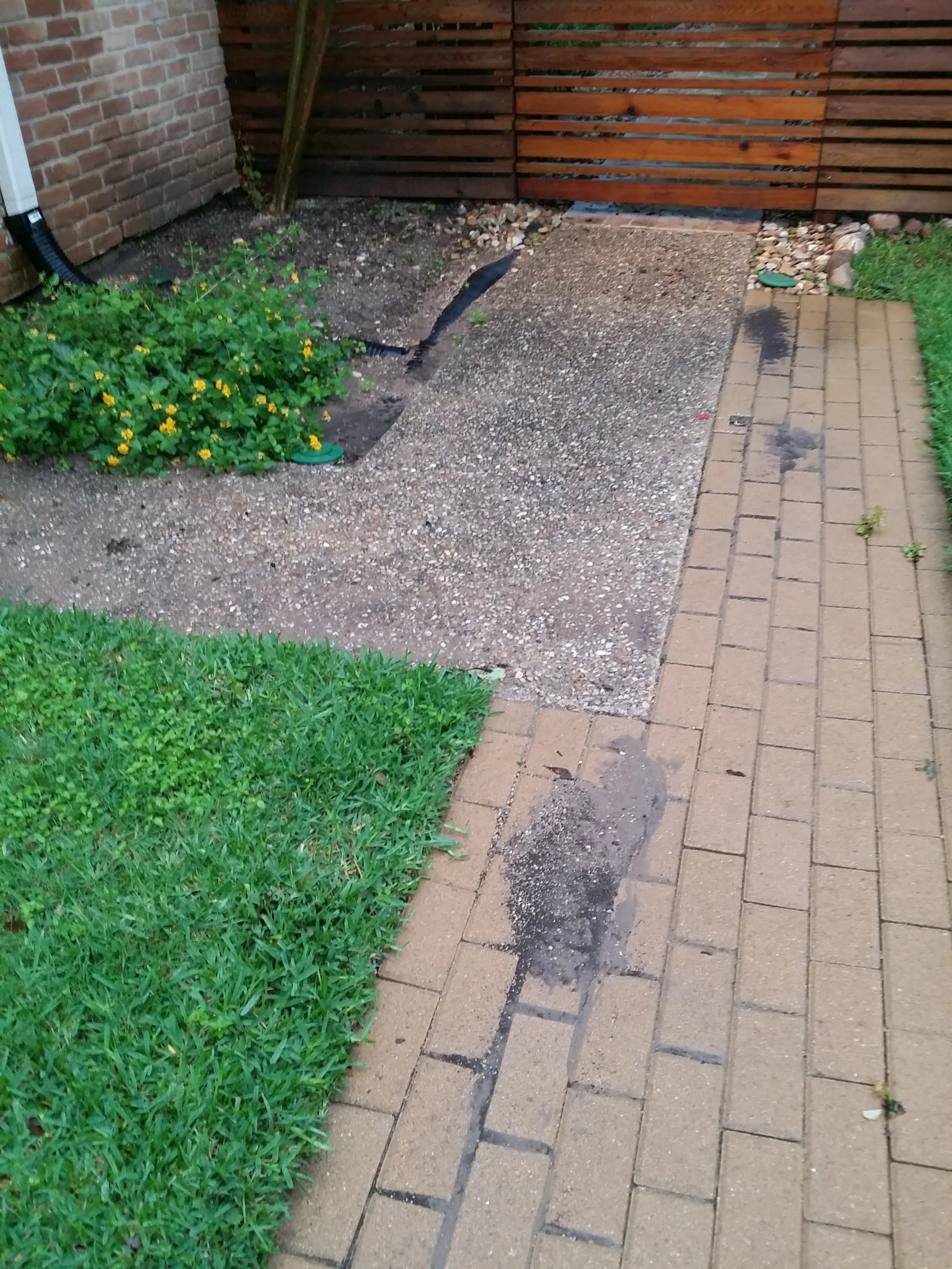
Instead, I took a more comprehensive approach.  First line of defense was to carry the roof runoff away from the yard and discharge it at the street.  I sized the roof gutters and downspouts for each section of roof area.  I replaced my dinky 4" gutters (which overflowed all the time) with 5" gutters that were big enough to handle the volume of water running off the roof surface. Then I added a few downspouts.  I connected the downspouts to corrugated PVC pipes that were buried below grade, going out to the street.  I installed clean-outs at the transition between the downspout and the pipe.  (No, I did not get leaf covers for the gutters, as they were beyond my budget at the time). Because of the lack of slope, I had to do pop-up drains at the end of the lines.It works like a charm. In a rain event, the water pressure in the underground line forces it to pop-up and spill over at the street.

To handle the surface water at the grade level, I installed a french drain all along the length of the property from the back corner to the front, also tied to a pop-up drain.  The HOA cut a swale into the berm at the front lawn.  They didn't want to spend the money to pave the swale, but had to come back later and do it anyway, as a grassy swale is not a very effective one.

And voila, that fixed it.  2" of rain in an hour and no flooding.

Now, I just need to keep my gutters clean.  Ugh!  I should have invested in the leaf covers.

Cheers,

Sharon.

A happy place - in the middle of a freeway

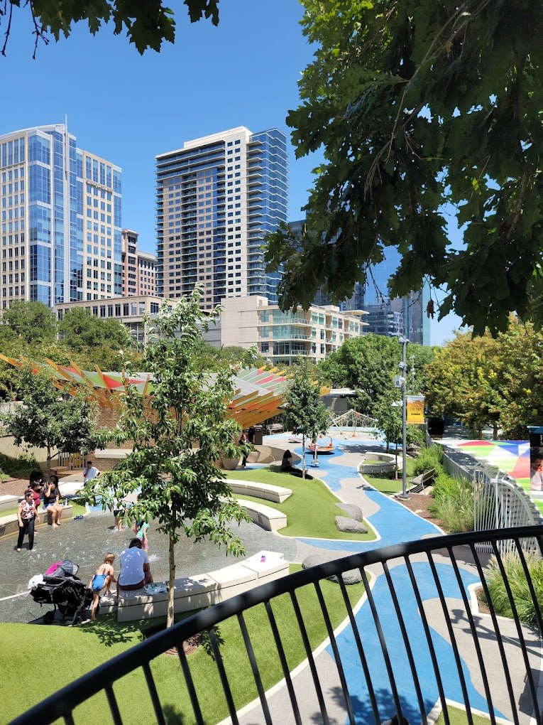
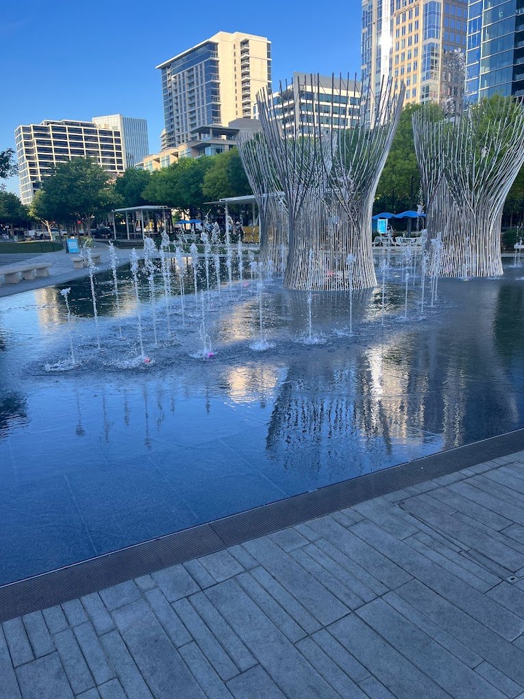
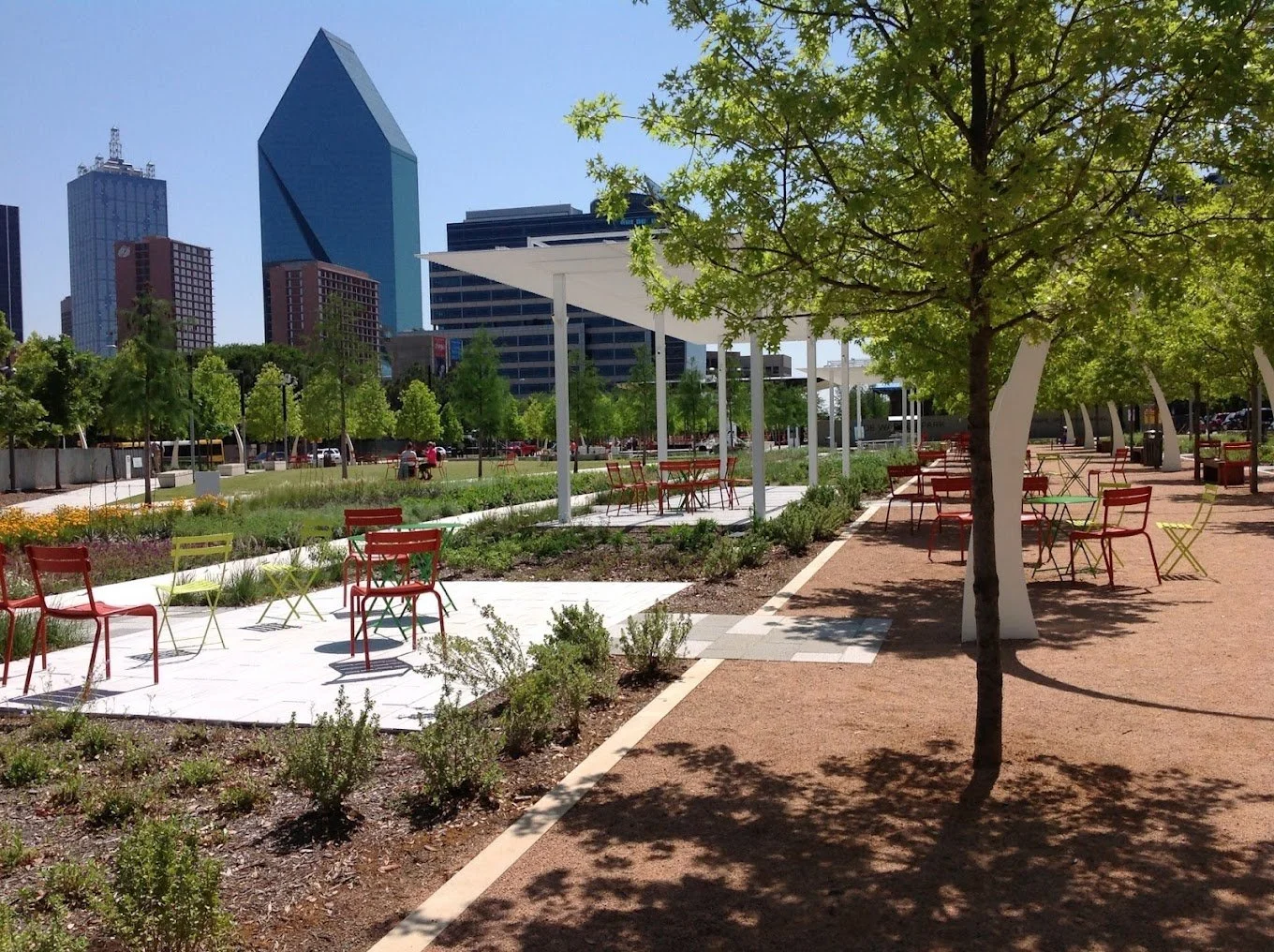
I was in The BIG D over the weekend to hang with my good ol' girlfriends from architecture school. We went out for dinner and drinks to the gastropub in the hip and happening Klyde Warren Park, at the intersection of uptown and downtown Dallas.  It was a wonderful spring evening and the park was teeming with people - lines at the food trucks, children frolicking in the water jets, people kicking back on the lawn, kids at the playground, people strolling along the tree-lined promenade.  To think that just a couple years ago, this spot was empty.  Literally.  It is, after all, a man-made green-bridge over the sunken part of Woodall Rodgers Freeway. What used to be and what is now.

Quite the transformation, don't you think!  From dull grey to vibrant green, a dark chasm to a sunlit nexus, from zipping by at 70 miles an hour to standing still.  There is something about greenery that changes a space from dire to a happy place.

While this is not the first deck-park ever, it is certainly one of the most ambitious and more successful ones.  It received the prestigious 2014 ULI Urban Open Space Award as "an outstanding example of a vibrant public destination that has enriched and revitalized its surrounding community".  Also, it earned LEED gold. 

Good thing they decided to go all the way and build 5 acres of deck instead of opting for the "practical and economical" alternative design that was initially proposed.  The fact that the executed design option was over twice the original estimated cost of $45 million is, well, money under/ over the bridge!

It is apparent that this new urban oasis has become a destination for Dallasites and visitors alike.  I've been to Dallas twice since the park opened in the fall of 2012 and paid a visit both times.  Once with my hair down, entertaining kids, and the other in stilettos.  The park lent itself well on both occasions.

In no small measure, a result of it's design.  This is no nature trail.

The contemporary design is courtesy of The Office of James Burnett, a renowned landscape architecture firm based in Houston.  Carefully crafted amenities (that attract a variety of people) are arranged along a sweeping pathway like "outdoor rooms" that reveal themselves as you stroll by.  A gleaming performance pavilion, a modern restaurant, a gathering turf bordered by shapely trees, a garden, multiple water features - all perfectly manicured spaces, packed with purpose.

Seems only fitting.  The urban context is hard to miss in the shadows of the  500 foot tall Museum Tower (by Johnson Fain), Chase Tower and Trammell Crown Center (by SOM), and other notable skyscrapers that define the downtown skyline.  The park needs to stand it's own around architectural icons that surround it, such as the Fountain Place Building (by I.M.Pei), Dallas Museum of Art (by Edward Larabee Barnes),  Nasher Sculpture Center (by Renzo Piano), Perot Museum (by Morphosis Architects), etc.

Indeed, there are 320 Oak and Cypress trees, all in a neat line, but no, the idea is not to transport you to the midst of a natural landscape.  But to bring people to the midst of the city.

To that end, the park management does a fantastic job of keeping their event calender full of free activities, and promoting the park through press releases, blog posts, and social media.  Although the park is owned by the city of Dallas, it is privately operated by the Woodall Rodgers Park Foundation.

My friend clearly takes pride in this addition to her city, as well she should.  It takes many steps away from the perception that Dallas is a concrete jungle dotted by large parking lots separated connected by a web of multi-lane freeways.  In fact, the improved image is the result of 10 year initiative to add more green space to downtown.  And it all started with a vision.

Cheers,

Sharon.

Cabins from another era

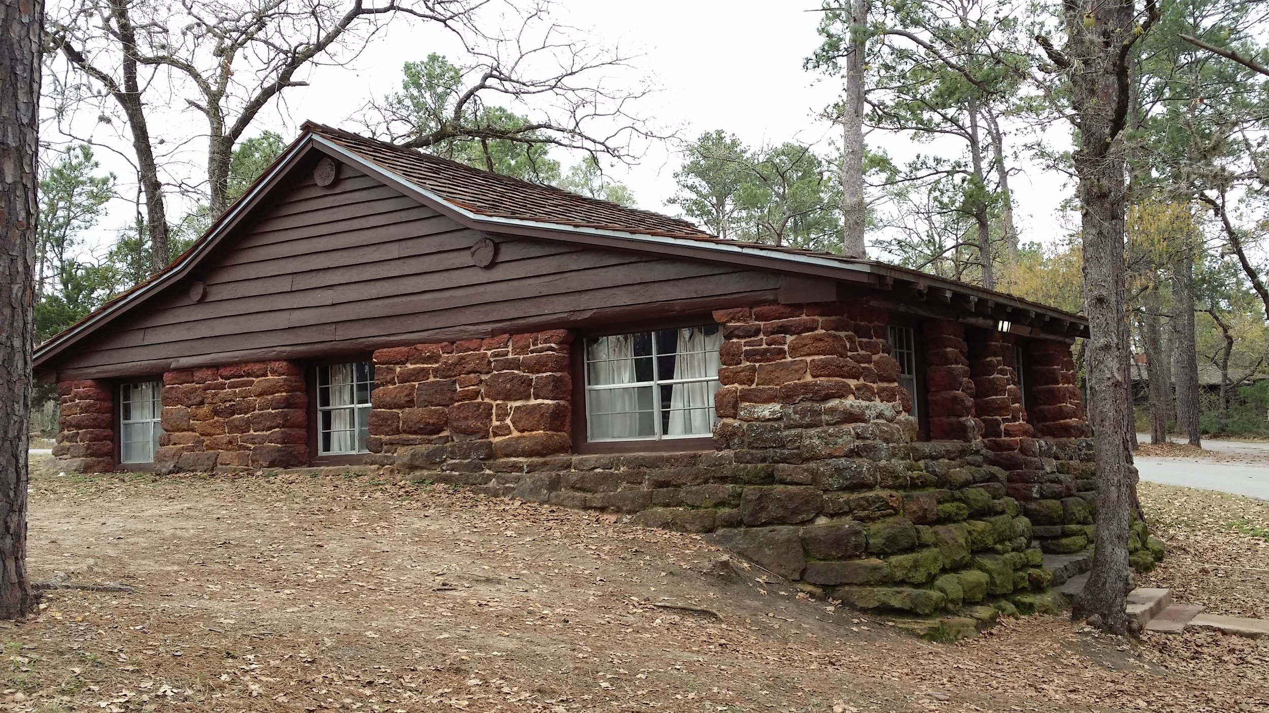
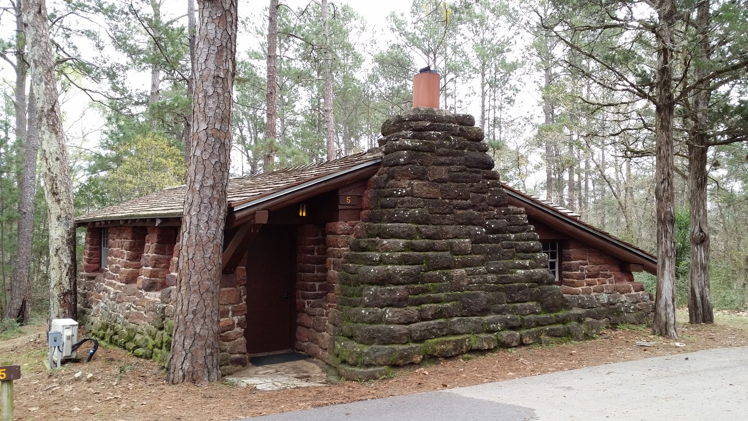
I went camping at Bastrop State Park (near Austin, Texas) recently and made a point to tour the historic cabins that were (thankfully!) saved by firefighters during the 2011 wildfire.  By implementing emergency measures, they were able to save 13 buildings in Pioneer Village; 3 buildings elsewhere in the park from the same era were engulfed by the fires.  The park itself is still recovering and has a long ways to go before it goes back to being the quiet lush park shaded by tall green pines.

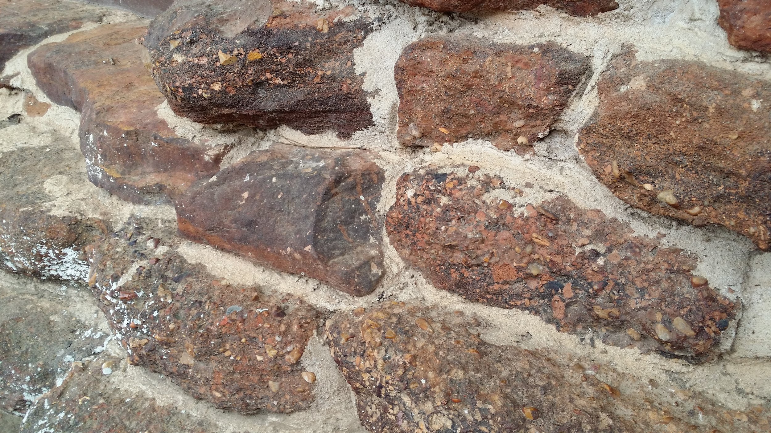
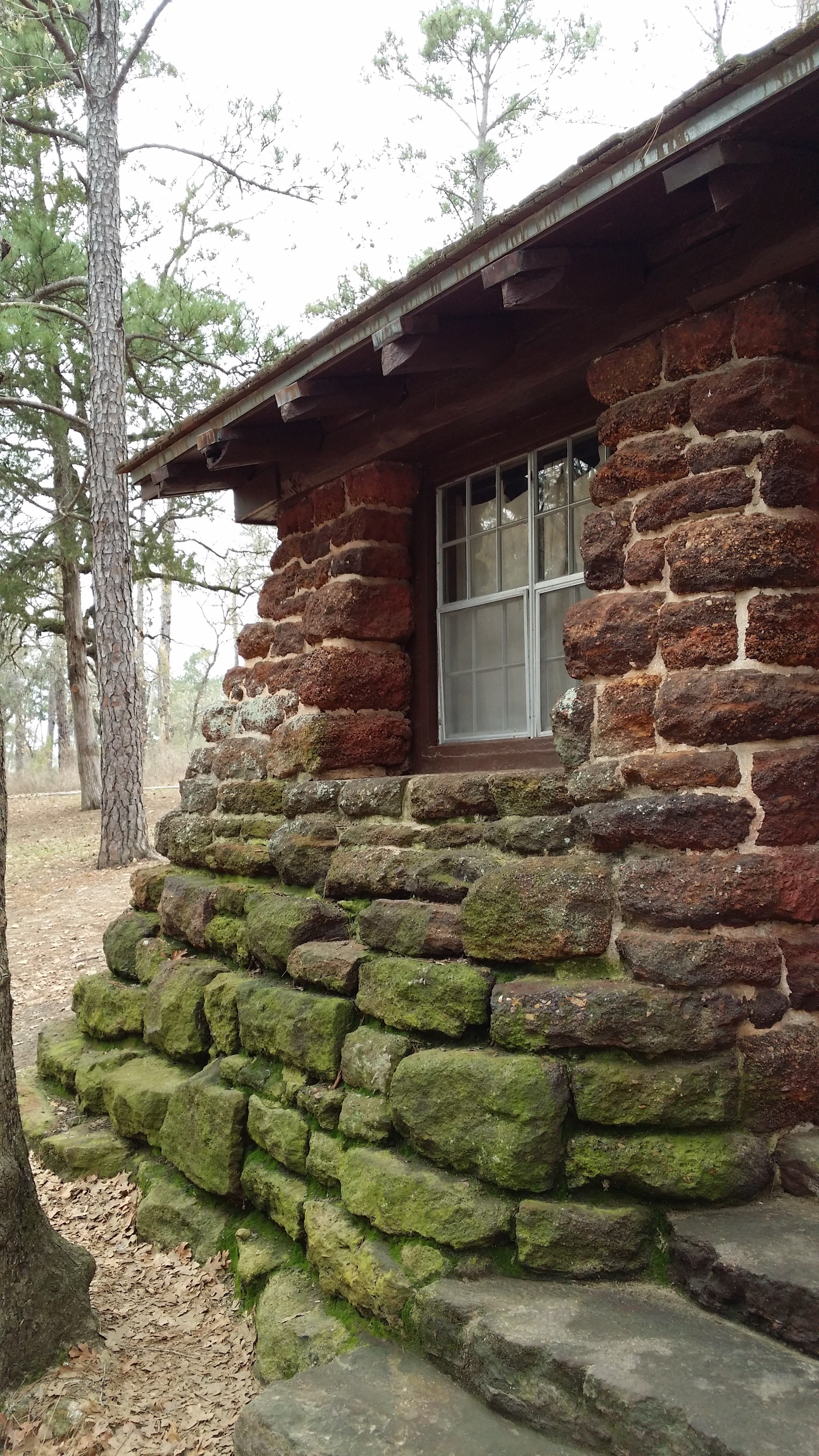
The cabins in the park were built by the Civilian Conservation Corps (CCC) as a part of the New Deal program instituted by President Roosevelt during the Great Depression.  (All you history buffs will find this website interesting).  Almost 85 years later, they still stand as a legacy of the time.  Built using true masonry construction techniques and local stone, these small buildings look like they grow out of the rocky ground.  Of course this was the intent of the park’s architect, Arthur Fehr, and the design principles of the National Park Service – to be harmonious with nature.  

All building materials were local and native to the “Lost Pines” region – large timbers for the roof structure, cedar shakes for roofing, clapboard siding; load bearing stone walls that stagger from the base to the top.

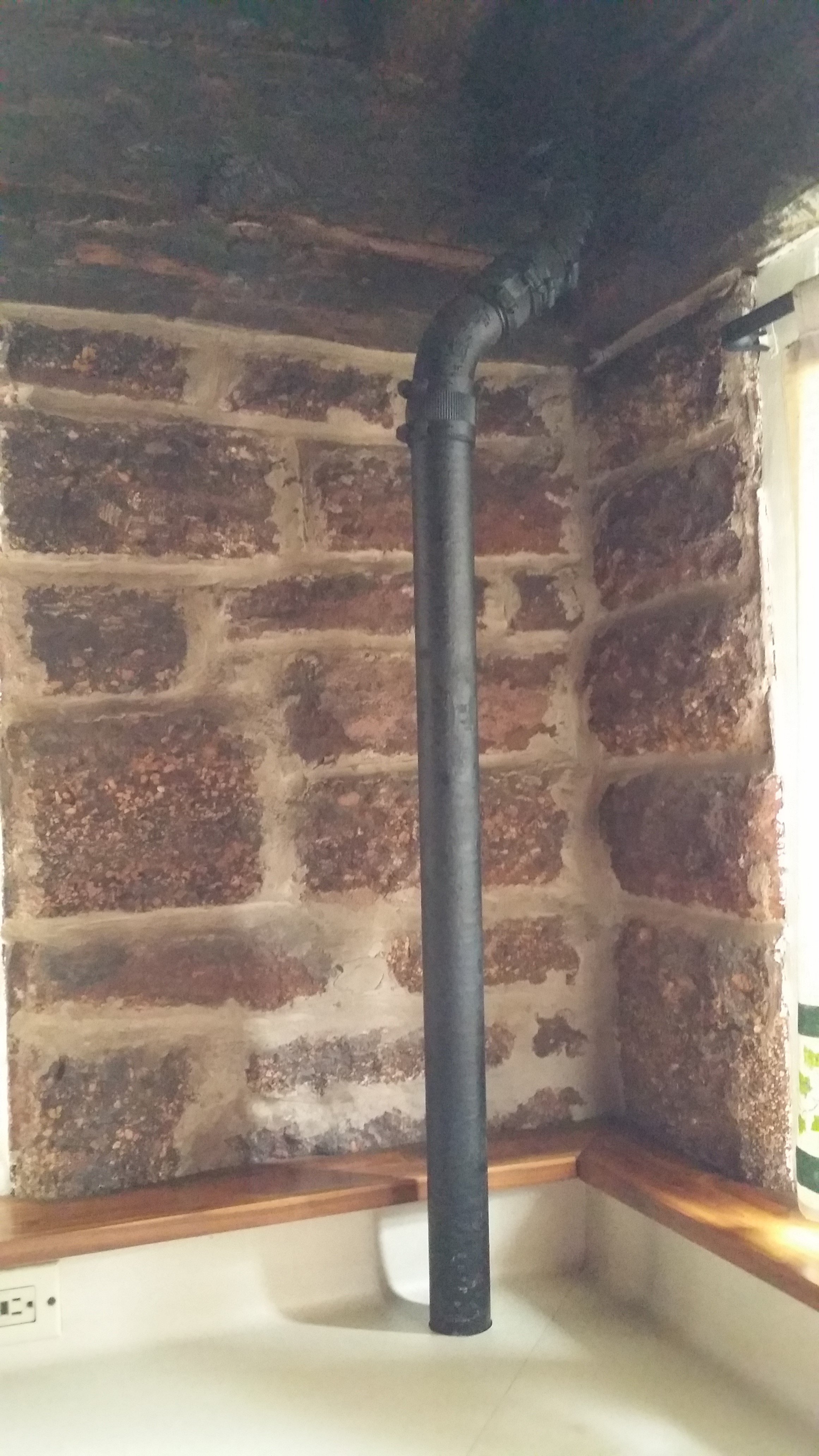
These small camp houses showcase the durability of building with rock and using good construction techniques (through-wall flashing, cap flashing at exposed rafter tails, cast iron waste pipes).  Sure, there’s some moss and lichen growing on the rocks, but that only adds to their character. (Incidentally, the rock reminds me of the laterite rock that is abundant in the southeastern state of Kerala, India, and therefore used in much of historic building construction there).

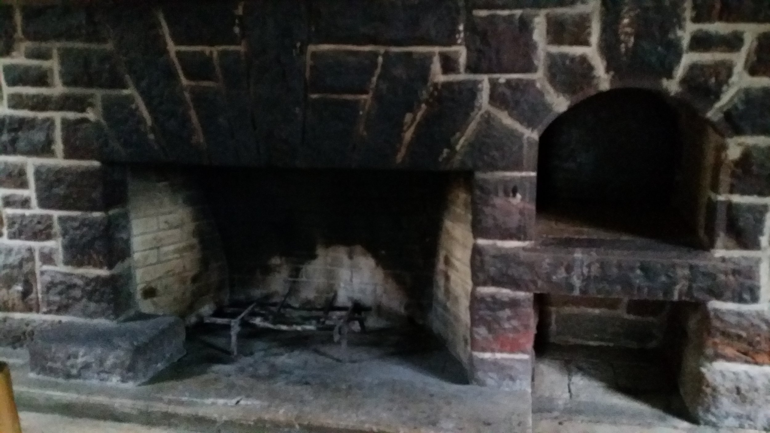
Aren't these little cottages just adorably cute?! Of course, these are mini vacation houses with quaint dark interiors - a limitation of the building material and construction method. (Nothing like the large mansions we build and live in today).  But then, they have a living room with a wood burning masonry fireplace, a kitchenette, a couple bedrooms, a bathroom, a patio facing the lake with a grill - what more does one need to enjoy a weekend getaway!

In doing some research for this post, I discovered some really nice drawings that were done for the building commission.  If you like to look at old architectural drawings, you should definitely check out this website.  Not only are they great hand-drawn floor plans, sketch elevations, and vignette drawings, there is so much detail in some of them that they qualify as excellent construction drawings.

Drawing

Cheers,

Sharon

You spec me to buy that?

Over the last few months, I've been working on the designs for a spec house in Houston and another in a new development in Austin.  "Spec" is short for "speculative" and the term "spec house" refers to a custom house designed and built based on speculating what a potential buyer, looking in a particular neighborhood and price point, would want in their house.  Stick to the bare minimum, and they will buy the other house; add all the bells and whistles, and you bust your budget.  The key is to find that sweet spot and a design that people will fall in love with.  They are custom in that the design is tailored to a specific site and not repeated on other lots like production houses i.e. they are unique. The firm I work at is developing both projects, which means that we buy the land, formulate the program* and size of the house, establish the construction budget and potential market value, decide on aesthetics and architectural style - all things normally dictated by a client.  Being a full service design-build firm, we are well equipped to handle all aspects of design and construction.  These are multi-million dollar projects, so it pays to scrutinize every aspect of the house with a magnifying glass. Architectural design, interior design, landscaping, pool design - everything from the floor plan to the floor tile is laid out on paper.

To that end, the core team meets every Friday, over lunch and cookies, to review and critique the progressing design.  We are a group of four architects, an interior designer, and a real estate advisor.  We talk about intent, big picture plans, small construction details, project schedule, what inspires us, contemporary work, what was successful in past projects, what was not; we make adjustments to the plan, exterior massing, interior volumes, materials, appliance package, cabinetry design; we look at interior design selections like decorative light fixtures, tile, wall finishes.  We explore design ideas that might otherwise be restricted by a client or their budget.  Sometimes it's a "best bang for the buck" or "ROI (return on investment)" conversation.  Other times, we revisit areas of the house that we were fine with for weeks, but then someone asks a poignant question and if we don't care for the answer, we go back to the drawing board.  Since it's a collaboration between different design professionals, the process is not linear, rather we go where the conversation takes us - all over the place!

We are now at a point where everyone is happy with what we've created on paper.  We are well past the schematic design stage.  We are mostly done with design development.  I say mostly, because that's never a closed chapter!  We have a long way to go before these babies are ready to go to school though.  We've only just started the the third trimester.   We are about to get into the thick of doing construction drawings.  While the architects coordinate the engineering and put the finishing touches on the drawings and specifications, others are working on the financing,  the construction team will soft start the project by getting permits and utilities setup.  Then the builder will start preparing the site for foundation.  I'm getting ahead of myself.

Being in two distinctly different markets, the design decisions made for each project are very different in order to cater to the potential buyer's assumed taste and values.  For example, the house in The Woodlands is much more formal than the one in Austin.  While every family is different, there is a common thread of needs and desires.  A well thought out spec house would be ideal for the family that does not have the time to work with an Architect, but would appreciate a house of this calibre.  Spec projects enable us to craft our brand, which by the way, we are in the process of reinventing.  All in all, very exciting work.

Cheers,

Sharon.

* A "program" refers loosely to the scope of the project; more particularly to the list of indoor and outdoor spaces that would be ideal in a building project.

Inspired Innovation

I like to draw parallels.  Literally and figuratively.  Literally speaking, it's a habit from doing line exercises in first year architecture school.  Figuratively speaking, it is comforting to see what lines up, who is on track with you, the familiar, that which follows expectation.  On the other hand, it is very interesting to see where things starts to veer off in another direction, why and how, the twist in the tale!  Is it new?  Is it novel?  Is it exciting?  Eyes peeled, ears perked up, everyone wants to know, we make the time to find out. Last weekend, I went to see the world premiere of Belle Redux/ A Tale of Beauty and the Beast, a modern ballet produced by Ballet Austin.  It was very different from anything I had seen before or expected in a ballet performance.  It was no familiar fairy tale.  Quite the contrary.  It was dark (literally and figuratively), daring, layered, interpretive, inquiring, lingering.  In an encore following the ballet, director Stephen Mills talked about the project, the process, and the result.  The directive was to be innovative, plain and simple.  No small feat there, but I think they hit the mark.  And I say that not because they used multi-media or donned contemporary costumes, although that certainly set the stage, but because of the power of the narrative.  It's been 4 days since, and I am still thinking about the performance, and digging up the story behind the stage.  I'm still peeling the onion, exploring the interpretations, and thoroughly enjoying myself.  Isn't that the purpose of art?

There are three things that have been lingering on my mind - the act of innovation, the subjectivity of beauty, and the fruit of criticism.

Mills describes innovation as "the act of making something better, more interesting, or more useful."  I cannot help but draw a parallel to the art of creating architecture.  Architects are known to be creative people; innovative, however, not the first adjective that comes to mind. Why the heck not?  We make things better, more interesting, and more useful!  Well, some architects certainly do, more so than others.

Aren't creation and innovation intricately woven together, being two sides of the same coin?  In the context of architecture, what exactly is the difference between an innovative idea and a creative idea? Is innovation so intimately tied to processes, execution, and well, technology, that it seems irrelevant as a concept in architectural design?  Where do you draw the line between creativity and innovation in the arches and vaults of ancient Roman architecture?  Would you say that creative architects gave us the likes of the Sagrada Familia and innovative architects gave us the skyscraper?

Some might argue that innovation lies in the process of turning creative ideas to reality, and while an idea might come from a single person, it takes a team to innovate.  Any creative person, scratch that, everybody knows that ideas are aplenty; turning that to reality is the mountain ahead of you.  Was it Edison who said "Innovation is 1% inspiration, 99% perspiration."  Every practicing architect knows the long journey from concept drawings to getting the keys to the building - you don't get from point A to B without team work and collaboration.  Solo architect is a misnomer.

In my work in residential architecture, it is very evident that the client sitting across the table from me is there because they want something better.  From the initial bubble diagram, there is an opportunity to be creative and innovative.  Perhaps it's a challenging site or orientation, a personal pet peeve that needs to be addressed, the building material selection, the construction detailing, a project delivery method; there are opportunities at every step of the way. Maybe it's not the concept or the design, but the client's experience working with the architect that was the best aspect of the project.  Or maybe the waterproofing detail is the most innovative thing about the house.  It is simply better than it could have been.

Something that Stephen Mills said after the ballet resonated with me.  He said, "Who decides what is beautiful and what is beastly?" and then of the show he said, "some people might love it, some may not get it, and some might hate it, and I'm okay with that."

In the architecture profession, there is a lively debate about architectural style, with the architects in one camp bashing the others.  Our work is criticized by our peers, the public, and the media.  Have you ever seen the show "Extreme Homes" on HGTV? They showcase houses from all over the world that range from bizarre to spectacular, low-tech to ultra-modern, mundane to beautiful, yet extreme in some unique way.  I like to watch it, mostly because it's interesting to see what personal architecture looks like in other parts of the world, but also to understand what motivates different people and how it reflects in their built environment.  One size does not fit all.  Standing at the curb, it's easy to pass judgement on the aesthetic choices or the architectural style.  But if you get to know the narrative behind the facade, you might not be so harsh.  Indeed, you might be inspired.

Cheers,

Sharon.

Architects in all shapes and sizes - architect avatars

This should come as no surprise, but not all architects are created equal!  I'm not referring to the product of their work, but the process of their thinking, the difference in the "kind of mind".  Broadly speaking, on one end of the spectrum, there are the architects who design using their right brain, and on the other end of the spectrum, the architects who use left-brain processing to solve problems.  No matter where an individual is on the spectrum, he/she brings value to the architecture profession in general and their projects in particular. Most architects fall somewhere in the middle of the spectrum and put on different thinking hats while juggling aesthetics, purpose, functionality, opportunity, construct-ability, durability, cost, etc to make design decisions.  However, every architect has either one strong avatar or several avatars that exemplify their core competency.  Based on my own personal experience, having worked with and for different architects, I've made a list of architect avatars. They are not listed in any order of importance and is by no means exhaustive.  Read on to identify your avatar.

The artist architect

These architects are primarily artists. They are sculptors who view buildings as their medium, using its three-dimensional form to express their ideas. To them, buildings are monumental sculptures in the landscape. They are the visionaries, the dreamers, the trend setters, the trail blazers.  They capture your imagination with their doodles, abstract thinking, and inspiring narratives.  We celebrate these architects whose buildings stand as a testament to their creativity.  Frank Lloyd Wright (and his Falling Water) is an iconic example of this avatar.  Contemporary architect Frank Gehry is known for his sculptural deconstructivist forms and his abstract sketches.

The philosopher architect

They are the explorers, the thinkers. They see architecture as a benchmark in civilization, and take a world view to ponder on the merits and demerits of architecture on society, its cultural statement, and it's long-term effects on humanity.  They question convention, push the boundaries of tradition, and redefine the paradigm. Their ideology dictates their practice and product.

The green architect

A subset of the philosopher architect, they care about the environment and are conscious about how buildings tax the earth's resources.  They make educated decisions to help lower the ecological footprint of the building and users, integrating passive architectural strategies and active energy-efficient systems.

The building scientist architect

They think about buildings as machines.  Buildings are certainly expected to perform like machines with modern amenities like air conditioning, electrical, low voltage, plumbing, and fire suppression systems.  Water management, thermal dynamics, insulation, etc are all topics that they geek out on - understanding the science behind the details allows critical thinking in a variety of applications. They have a strong aptitude for the sciences and math.  They love calculations, and enjoy a technical challenge.

The tech-savvy architect

This is the gadget girl and gizmo guy.  They strive to incorporate the latest in automation and technology.  Their buildings can be secured, monitored, and controlled by smart phones from across the earth; touch screens and low voltage wiring coming out the ears; audio-video systems and home theatre incorporated; motorized shades and solar control everywhere; everything from the fire-pit to the water fountain can be controlled remotely; so much so that a single family residence requires a low-voltage room for all the equipment.  Okay, maybe this is a client avatar.

The designer architect

They have a strong passion for design and their work exemplifies the true meaning of design. They delve deep to identify the crux of the problem and find inspiration in unexpected places.  Their work is innovative and awe-inspiring.  I like to share this TED talk by architect Thomas Heatherwick of London as an example of the quintessential designer architect avatar.

The builder architect

These are the architects who care foremost about how buildings are put together. Their designs are limited by the question, "is it construct-able?"  They take great pleasure in figuring out how something will be built, and detail the crap out of their project, all the nuts and bolts figured out, on paper, before ever breaking ground.  Or he/she is at the job-site ready for some hands-on work!  They most likely grew up with builder parent(s), spending weekends on the job-site!  They are the tinkerers, the practical people, the tether to the ground.

The artisan architect

A truly skilled craftsperson, evident in the artistry of their architectural drawings as well as their designs; they revel in the labor of their hands and minds/ imagination; their products are works of beauty.  Their talent lies in their ability to imagine the artful and translate it into a tangible three-dimensional object. They crave creativity in their day-to-day. Their hobbies might include model-making, carpentry, pottery, glass work, bread-making(!), and other crafts. The work of architect E. Fay Jones comes to mind, although I have no idea how hands-on he himself was in the construction of Thorncrown chapel or any of his other buildings.  Having been to Thorncrown myself, it's hard not to appreciate architecture that allows such fine craftsmanship.

The structural architect

This category includes the architects who like to show off the structural components of the building.  I might also call them turtle architects, as they take what others like to hide and expose it and express it in the most unimaginable and impossible way.  Santiago Calatrava exemplifies this avatar - of course he is an architect and a structural engineer, and his designs are beautiful expressions of ingenuity.

The shallow architect

Those who care only about the aesthetics - proportion, composition, cool factor, and sacrifice function for the looks (functionality is overrated anyway, right!).  They let the consultants work out all the other stuff - the systems suffer because the design failed to accommodate it.

The lazy architect

These are the architects who conform. They are so conservative and risk averse that they regurgitate what looked good and worked historically. They repeat what was successful in their last project, or worse, they copy what is trending in the latest publications. They develop a recipe.

The master builder

An architect in the age-old traditional sense of the greek word "arkhitekton" meaning "Chief Builder", being the artisan, builder, designer, engineer, superintendent, manager, estimator, and every other consultant involved in a modern building project.  I think it's safe to say that it's the rare Architect who can pull off this avatar.

Did I miss any?

All architects aspire to be artist and master builder, at once being on different ends of the spectrum. It's what you are conditioned to believe as your destiny after you graduate architecture school. But the truth is that the rigors of everyday practice of architecture put you on a certain path, and lead you in a direction. Not to mention, your personality and aptitudes get in the way.  And despite your best intentions, one of the above (less sought-after) avatars becomes your legacy.

We all need a small dose of external inspiration, and there is no shame in admitting that you are  going to adapt an awesome detail you saw in an open house, or are inspired by an incredible picture in a recent magazine.  Fact is, artist architects have patrons, all other architects have clients, and builder-architects have customers.  Let it not be said that you were led blindly down your path.

Cheers,

Sharon.

Architecture daily - more discovery, less creativity

Many of my non-Architect friends (some* of who went to Architecture school with me, but no longer practice architecture as they had the good sense to pursue a lucrative career) carry the impression that architecture is a field of  creativity - a profession where the creative genius roams free and untethered; that imagination is the agenda for the day; that if inspiration does not strike, there is no need to go into the office. Kind of like design studio back in architecture school - headphones, coffee, hoodies and jeans, trace paper crumpled up in the trash can, sketches all over the drawing board, books showcasing the works of celebrity Architects stacked high on the floor, large windows with sunlight bathing the room, yet a wilting plant on the window sill, budding architects lost in their computer screens ... you get the picture! Certainly, when I think of other creative professionals like musicians, writers, artists, or even other designers, I am guilty of the same perception. Are they encumbered by the mundanity of an 8 to 5 office structure? No, their creative juices flow whenever their genius strikes, might be the middle of the night or middle of a shower/ run/ swim or whatever they are in the middle of in their care-free life. Thereon they work relentlessly (in their pajamas, of course) like a madness has taken over, until the work has reached its pinnacle, whereupon it is presented to the world so everyone may appreciate the stroke of genius.

While there is a small nugget of truth in that notion, the reality of everyday practice of architecture is, I'm sorry to say, not so footloose and fancy free.  On the contrary, we labor each day investigating, exploring, discovering, questioning, drawing. Always discovering through drawing. What reveals itself when you cut that section? How tall is the space at this intersection of roofs?  Does that look proportional? What does it look like in plan view? Finding answers. Does this fireplace come in an 8' length?  Who will manufacture this custom door, and how much will it cost?  How far can I cantilever this beam?  Where can I buy this rubber membrane?  Where in the code book does it say so? But also important, asking the right questions. What exactly do you like about this picture?  Are you aware that doing "x" means getting rid of "y" which is actually a nice feature? Some answers only lead to more questions and you chase many rabbits down many holes, sometimes only to discover that the client does not have the budget for it.  And some answers bring the project to a grinding halt, such as a crippling discovery that a WQTZ (Water Quality Transition Zone)zone covers half the site meaning that our design concept and scheme went out the window.

What I am trying to say is that there is only a limited creative genius when there are real world constraints. Don't get me wrong, challenges often present opportunities for amazing design solutions that are truly inspiring. But creativity is a process and architectural creativity is a process of discovery.

There are days when I go into the office and all I do all day is review shop drawings, field questions from builders, troubleshoot consultants, and there is only problem solving. Then there are days when I can focus on architectural design. And then there are other days when the creative juices flow freely, unconsciously, and without effort,  sometimes when I am in the shower at the end of a long day of discovery, and it's just like poet Ruth Stone described her inspiration (to author Elizabeth Gilbert) -  it comes without announcement, rushing through me at a high-speed, in fullness and such vivid clarity, and in that moment I know this is genius. Then it passes almost as fast as it came to me and I fear that I will forget, and the idea will escape me, and I will be left empty.

Sharon George

*okay, I should say most, because really I've not made too many friends since those days

Why designing a custom house is like having a child

For starters, you cannot know before you start what you are going to end up with.  You might have a girl or a boy!  He might have your beautiful eyes, she might have your partner's bulbous nose.  Regardless, you will love your child and not ever regret having this little bundle of joy that you created.  From nothing to a whole new living breathing person who leaves an indelible footprint in your life - it's rather amazing!   Likewise, if you have made the decision to go through the effort of building a custom-house that fits your family, your personal needs, and your lifestyle, it's quite a responsibility, and it's worth it.

Your child's skin color, eye color, hair color, sleep habits, personality, talents, it's all a toss.  Well, maybe some characteristics are predictable within a certain level of accuracy based on the two people involved in the pairing.  Every child is unique and a direct result of the people involved.  Similarly with building a custom-house - the major players involved in the project have a direct bearing on the end result.  This includes the architect, the builder, and you (the client).  The hereditary gene pool for the project is established by this unique combination.

You bring your site, your aspirations, your requirements, your budget.  No two architects will produce the same design for the same set of criteria.  That's the beauty of working with an architect, isn't it.  Architectural design is a creative process, and the resulting product will be as unique as the individual doing the creating.  Heck, the same architect will come up with a different design if they sat down to design on a different day, but I will ponder on that in an another blog post.  Architects come in all sizes and shapes - that's why selecting the right architect is crucial to the outcome of your project.

Design is one thing, building is another.  Yet, the same principle is true.  Given the same set of drawings, specifications, and instructions, no two builders will produce the same building.  Most seasoned builders assemble a team of sub-contractors that they like to work with.  The process of building is still considered a craft.  While the framing might be done by any number of framers per drawings and specifications, we depend on the artistic eye of the mason installing the stone veneer, the carpenter doing the trim work, the iron guy welding the ornamental railing, the tile guy laying the floor tile, just to name a few.  Some would argue that there are talented plumbers and electricians too.

And then, there is the nature vs. nurture conundrum, which also directly applies to the collaborative work involved in designing a custom-house.  Your project develops a personality and characteristics that are dictated by conversations that reinforce or alter a hereditary trait.  At the end of the day, one cannot say whether nature or nature played a more vital role in the outcome. It just takes a life of its own.

Cheers,

Sharon.

Custom residences on Kiawah Island, SC - House Tour

Kiawah Island in South Carolina is a private barrier island surrounded by the ocean and vast salt marshes, known for its golf courses and multi-million dollar mansions.  I had the opportunity to tour some fabulous custom homes (designed by architects) during the AIA CRAN 2014 symposium and would like to share my pictures in a series of posts.  Alas, the pictures are not that great as they were taken in a hurry with my phone.  Not to mention, it was a cloudy rainy day, not ideal for great photography.  Better pictures are available on the architect's websites, which I will link to, but, this here is first person experience with candid shots. Respect for nature takes a whole new meaning when you have to design an environmentally sensitive building set in a delicate ecosystem with abundant wildlife and challenging soil conditions, lowcountry coastal climate, and flooding.   Being in a high risk coastal flood zone, all the houses are on raised foundation pilings, with the conditioned main floor almost a story above the approach walkway, the lowest floor serving as "enclosed" garage and storage that is "allowed" to flood, i.e. the houses are not on stilts.  Worthy to note here, the Architectural Review Board design and construction guidelines are 80 pages long.  So no, you won't see stilt houses on this island!

House by Architect Chris Rose

I loved this contemporary house designed by Architect Christopher Rose.  The simple floor plan layout was overshadowed by strong architectural features and a material palette that suggested warmth and comfort.

Chris Rose

The front facade and the stairs leading up to the unassuming entry; no grandiose door, no porch, no statement, simply enter.  The exterior color palette is meant to blend in with the surroundings.

Chris Rose

Nice vignette there at the entry foyer.  Most of the interior walls are finished with an earthy seagrass wallpaper, and trimmed with Douglas Fir - baseboards, window and door casing, accent frieze trim, beams.

Chris Rose

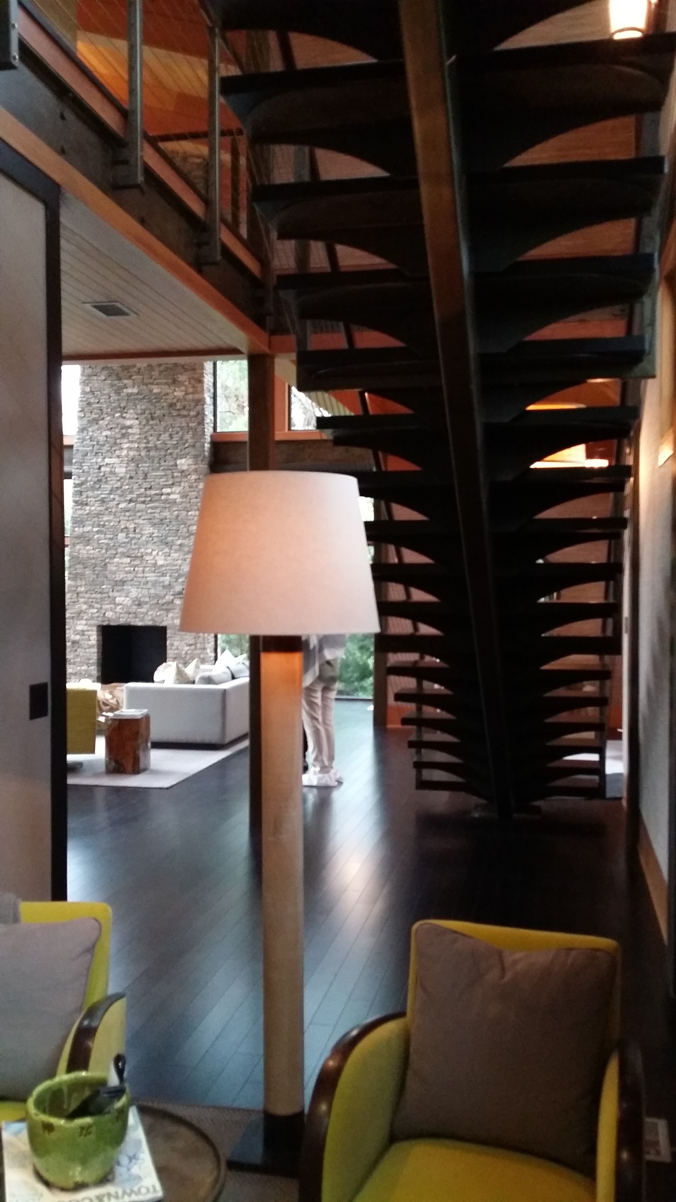
This industrial steel stair leads you up to the upper floor with the secondary bedrooms.  Isn't that beautiful - a piece of art built into the architecture of the house.

20140920_085844

It looks like a spine.  Unfortunately, it is *not* the spine of the house.  There's a missed concept!

Chris Rose

A cozy TV viewing area under the airy open stairway.  No need for a closet under this stair.

Chris Rose

I can't get over how cool this stair is.

Chris Rose

If you are interested in the detail - thick wood stair tread over 1/4" bent steel plate, cut to shape, welded to a steel tube center stringer, finished with a layered brush stroke, for an industrial looking sculptural stair that meets code.

Chris Rose

Chris Rose

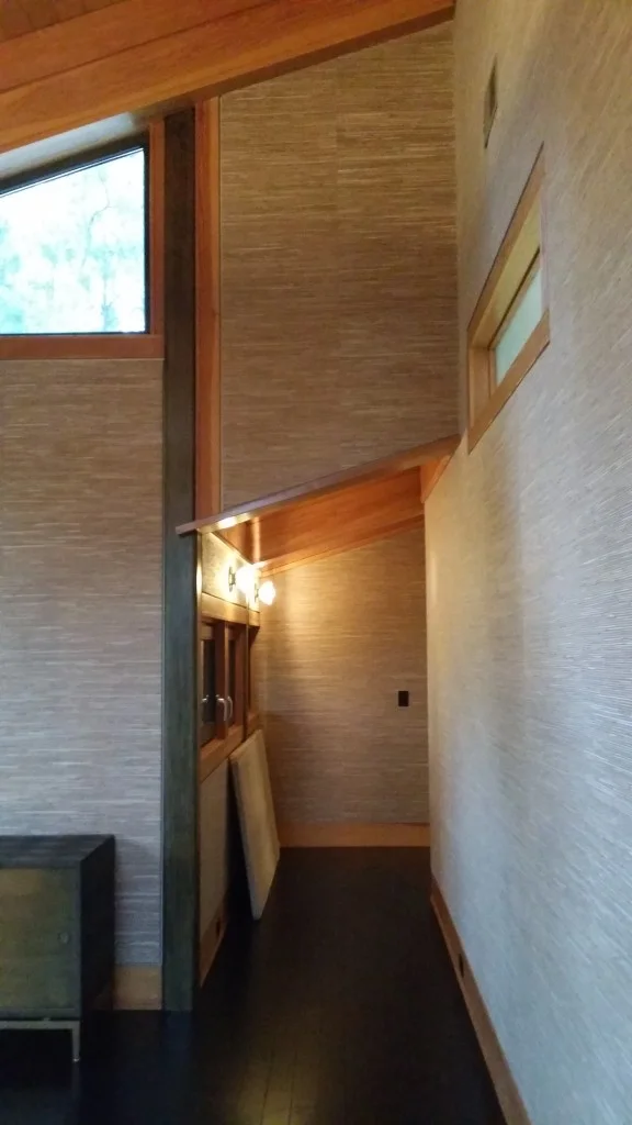
Moving on, upstairs to a hallway.  The steel structure of the house is exposed to the interior, but the industrial look is balanced by the earthy wallpaper and natural wood trim and ceilings, for a soft contemporary aesthetic.

Smooth cold steel, natural warm wood trim and wrapped beams, and textured seagrass wall covering - the perfect blend of materials.

Chris Rose

Dark wood floors contrast with light walls and warm wood ceilings.

20140920_085223

Overlook from the upstairs hall into the two-story living room below, with the tall stone fireplace and windows from floor to ceiling.  There's the architect Christopher Rose.

Chris Rose

Kids bunk beds, looking up into a skylight.

Chris Rose

Painted wood trim flush with the gyp-board and a neat shadow line created by a reveal separating the two materials.

Chris Rose

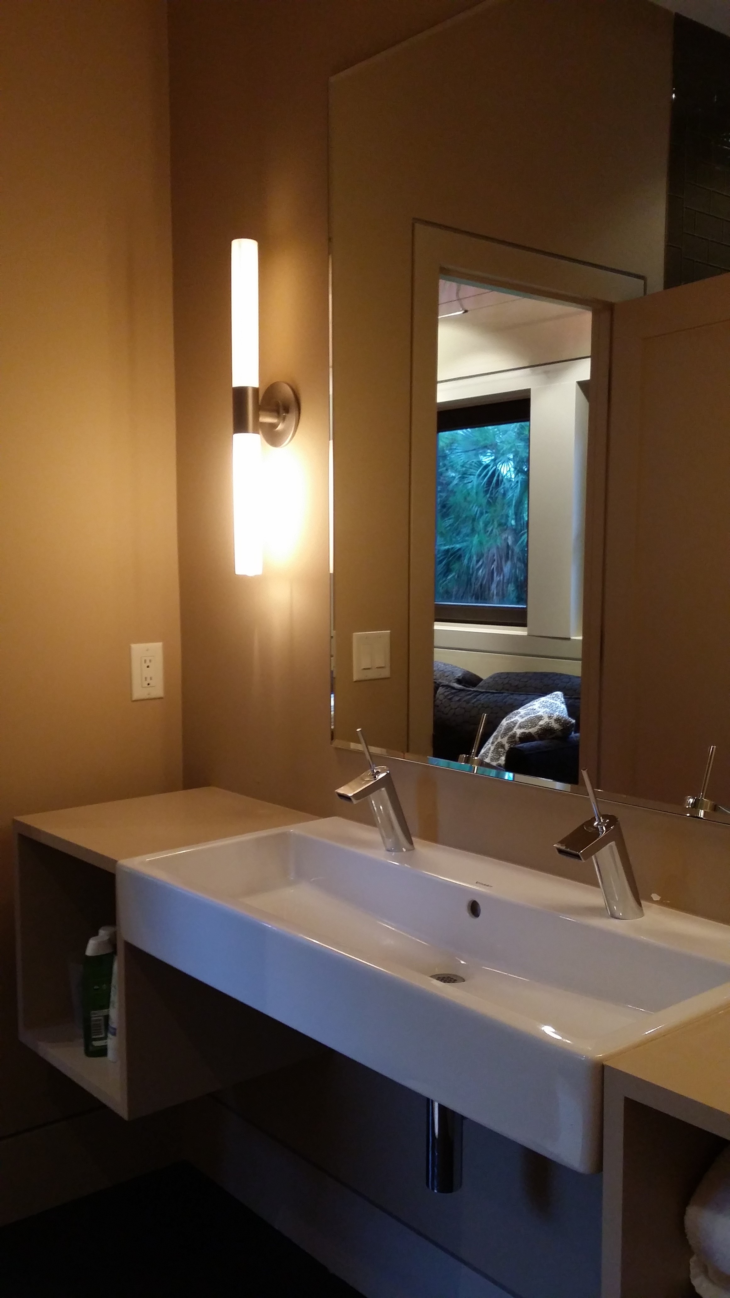
Extra long (double faucet) wall mount sink in a simple bathroom for the kids.

Chris Rose

The pool and deck in the back overlooking one of the many ponds in Kiawah.

Chris Rose

You can get a sense of the structural grid from the exterior.  The beams visible at the ceiling inside follow through to the exterior to support the deep roof overhang with steel brackets anchoring them to the steel columns.

Chris Rose

Outdoor shower mounted on the exterior wall of the lowest floor.  You can see the gaps between the siding to allow flooding of the lowest floor.  The mesh screen behind keeps the enclosed area relatively bug free and crap free in a flood.

Chris Rose

View from inside the garage looking out.

Chris Rose

Close-up picture of the wall on the lowest floor that is liable to flood - unfinished stud walls with mesh screen and exterior siding with gaps.

Hope you enjoyed this post.  Again, apologies for the fuzzy pictures.

Cheers,

Sharon.
AIA CRAN Symposium - The Architecture of Influence

I have just returned from Charleston, South Carolina where I attended the 2014 symposium of The American Institute of Architects Custom Residential Architects Network (AIA CRAN). Wow, that's a mouthful!  If you work in or run a residential practice, this is the part of the AIA that you need to follow and be involved with. I was excited about this symposium for three reasons. Firstly, I was looking forward to going back to Charleston and spending some time in the historic city, because the first time I was there, I spent most of my time on the beach.  Secondly, this was going to be my first time at a CRAN symposium and I had heard great things about the ones in the past, especially the home-tours.  Lastly, and most importantly, the theme: "The Architecture of Influence" - you cannot tell me that does not sound inviting to a bunch of architects.  Charleston was the perfect backdrop to explore this aspect of residential architecture.

"“The Architecture of Influence” will explore the importance of history and context in the design of new houses, and in particular how the careful consideration of historical architectural styles – both traditional and Modernist – can help architects design houses that contribute to established physical and cultural settings. How a new house or building looks is fundamental to how a community responds to it, and this symposium is intended to encourage an ongoing conversation about what it means to design a good architectural neighbor in the 21st century."

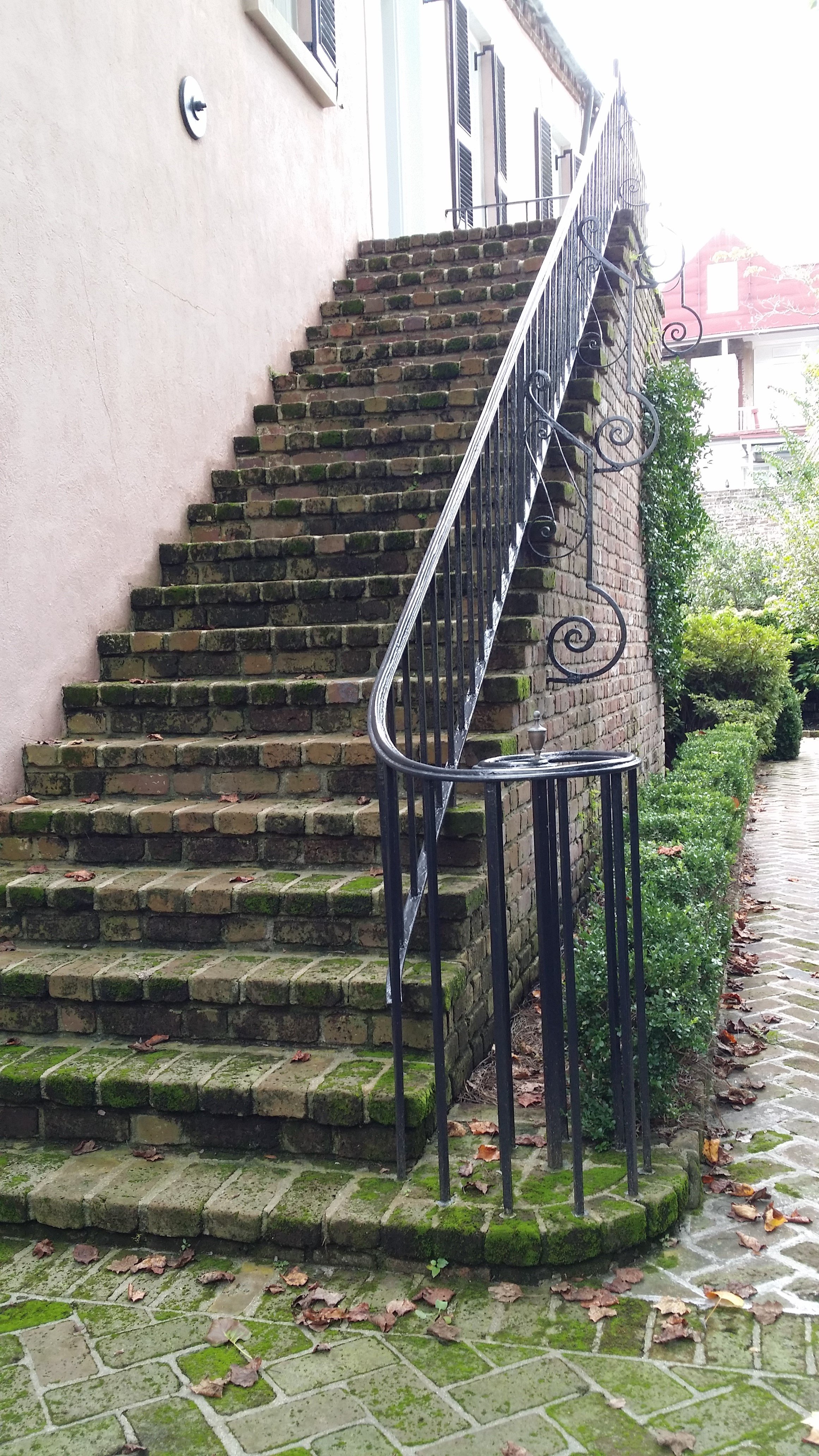
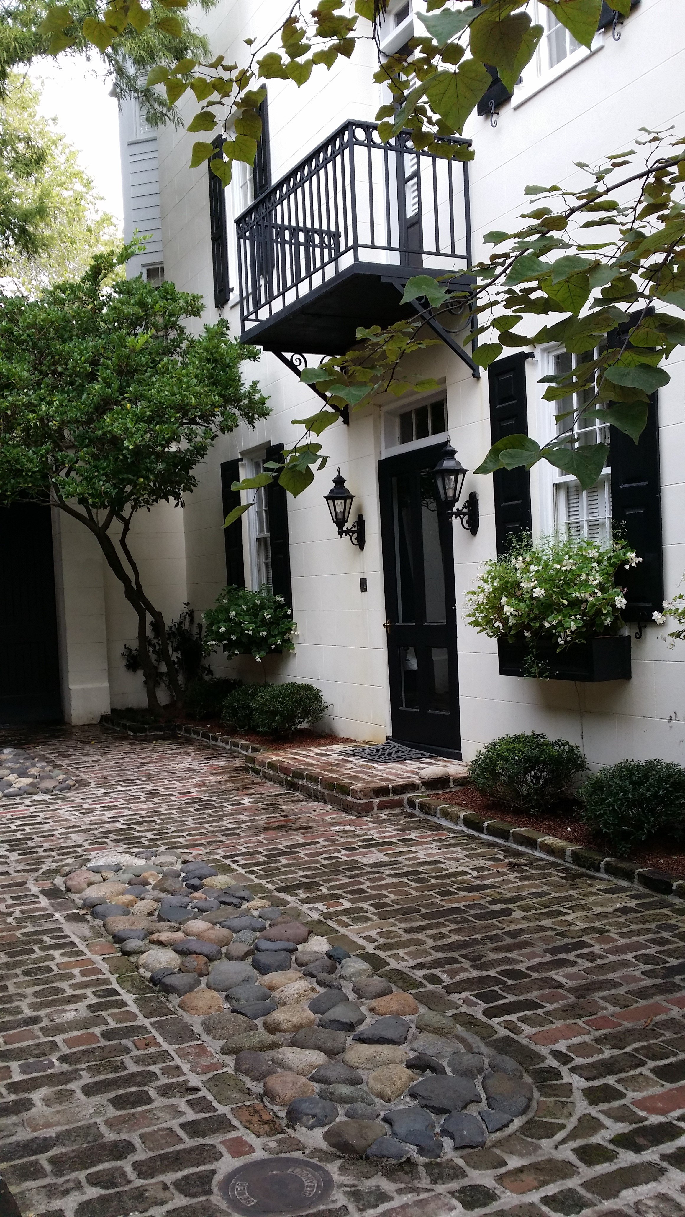
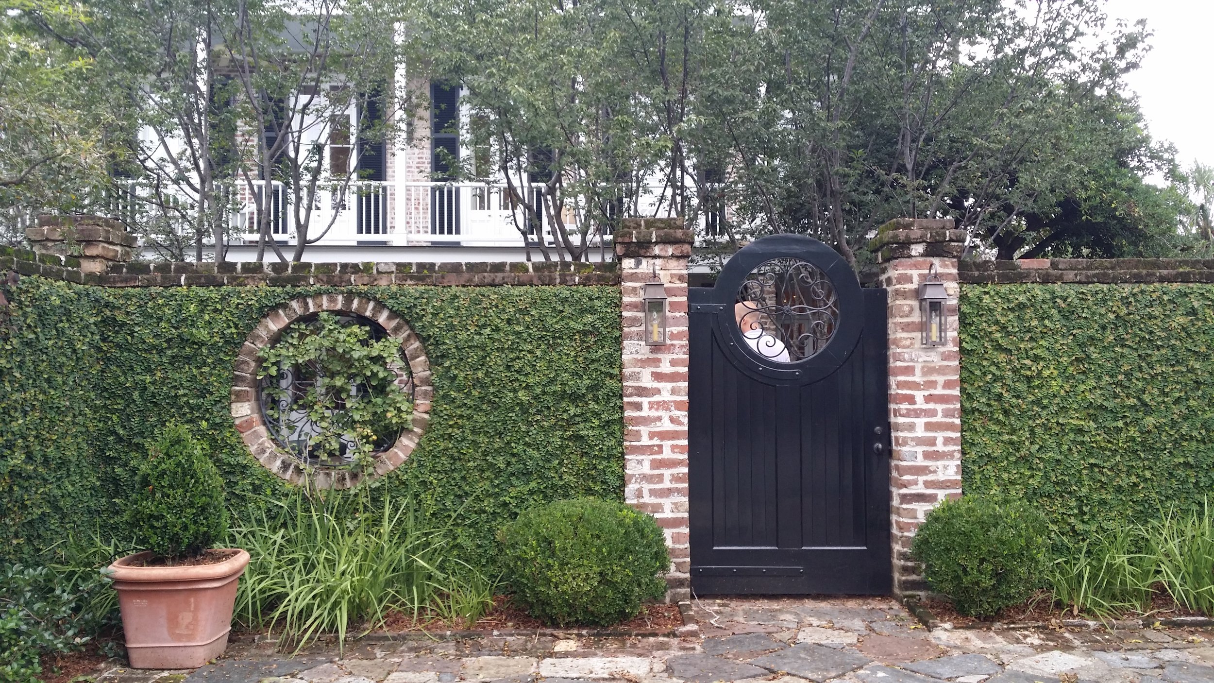
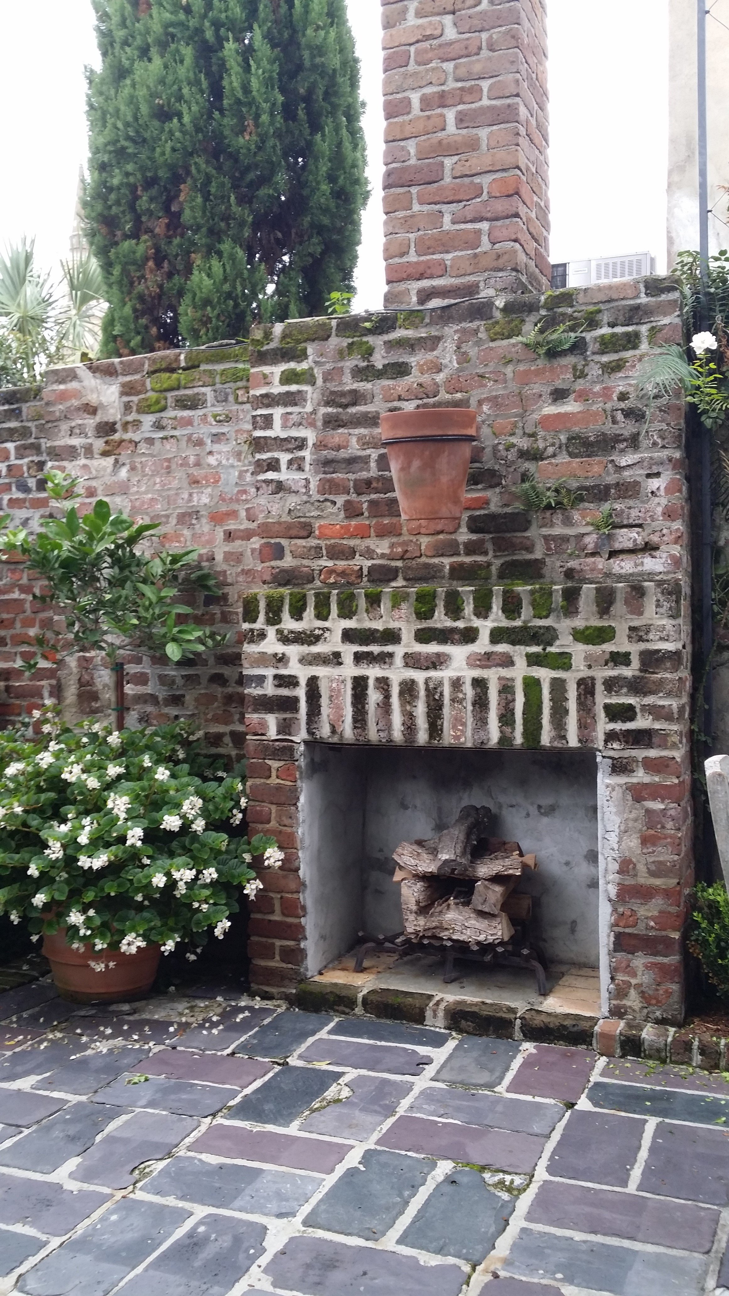
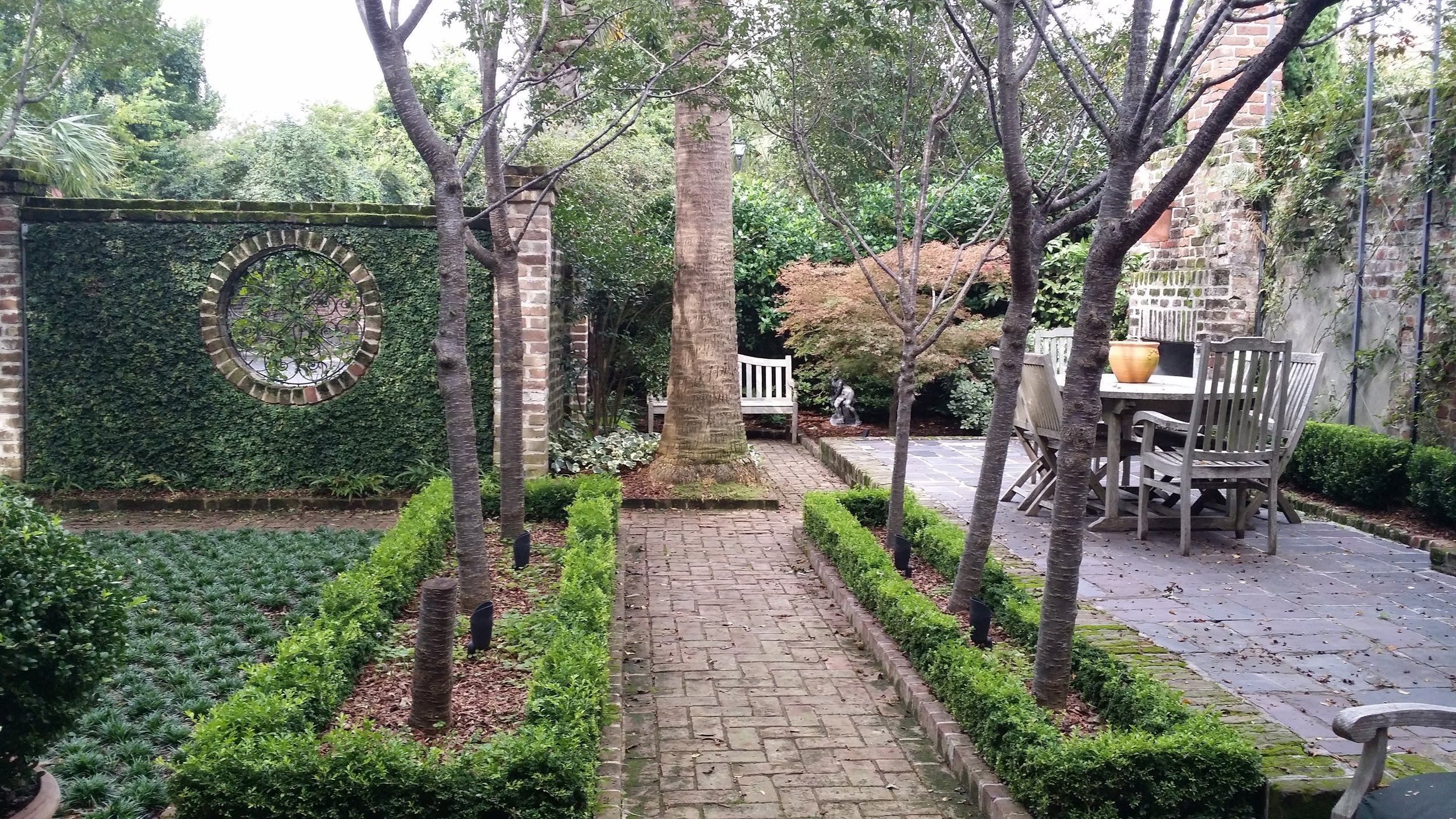
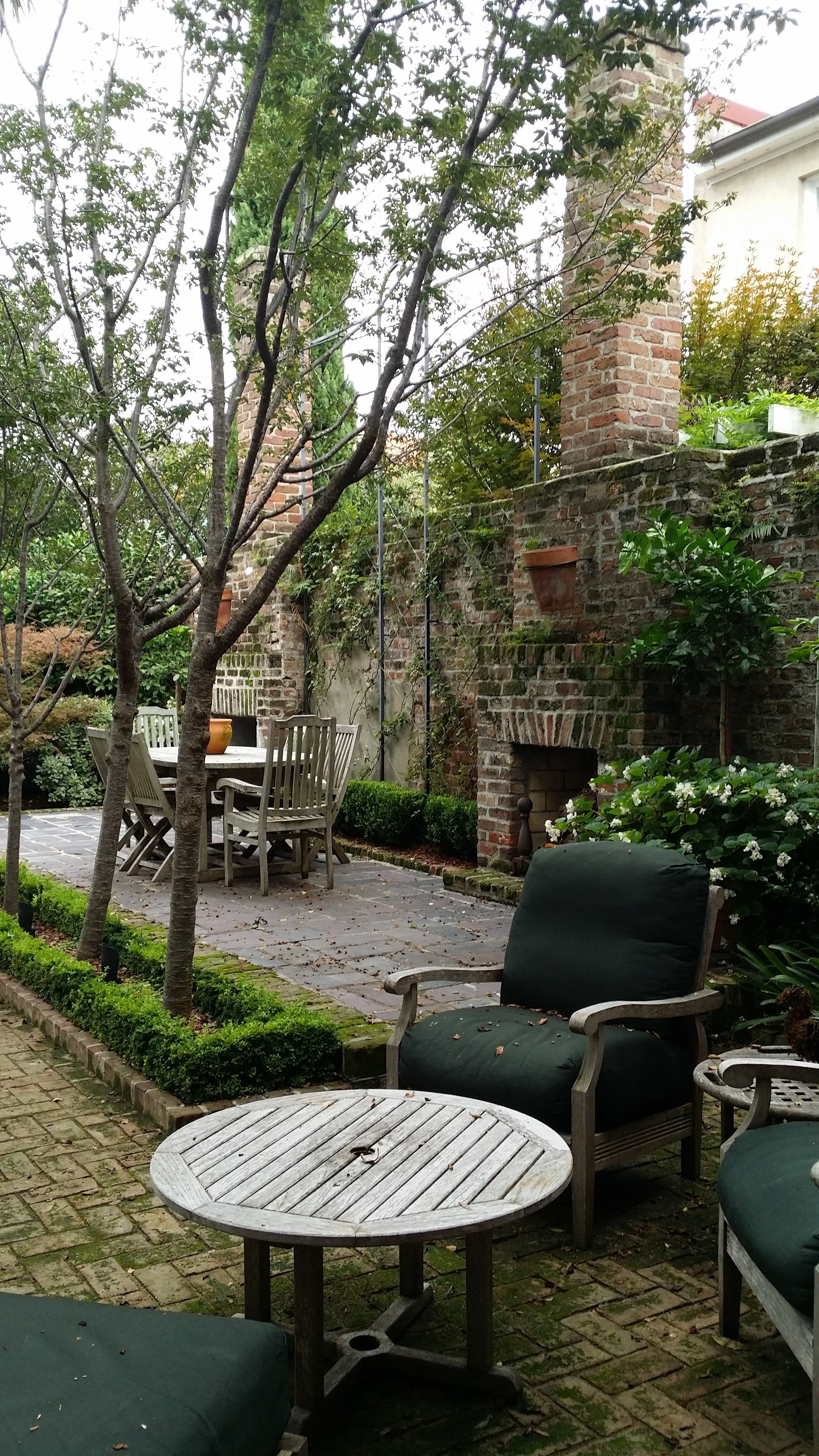
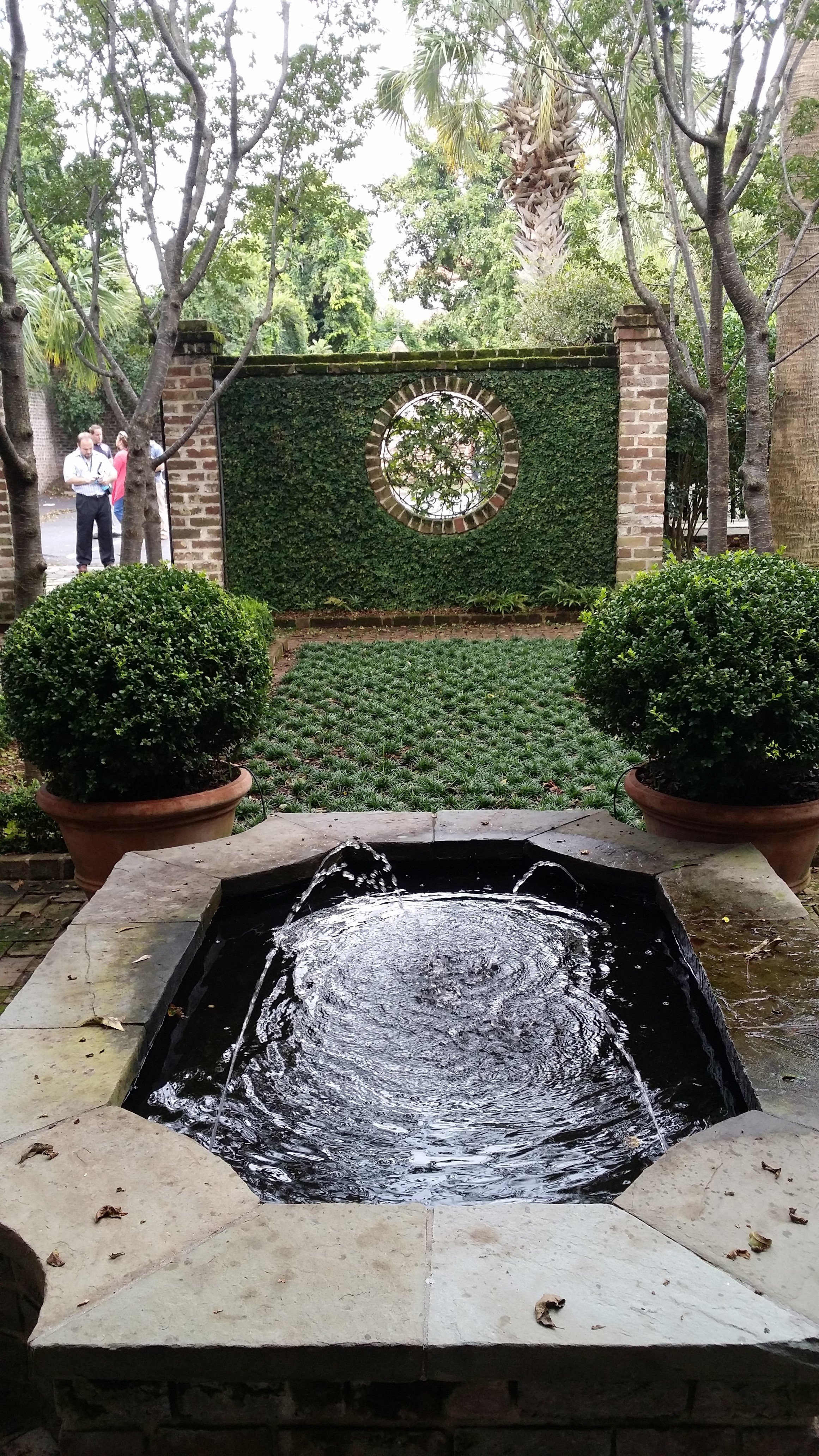
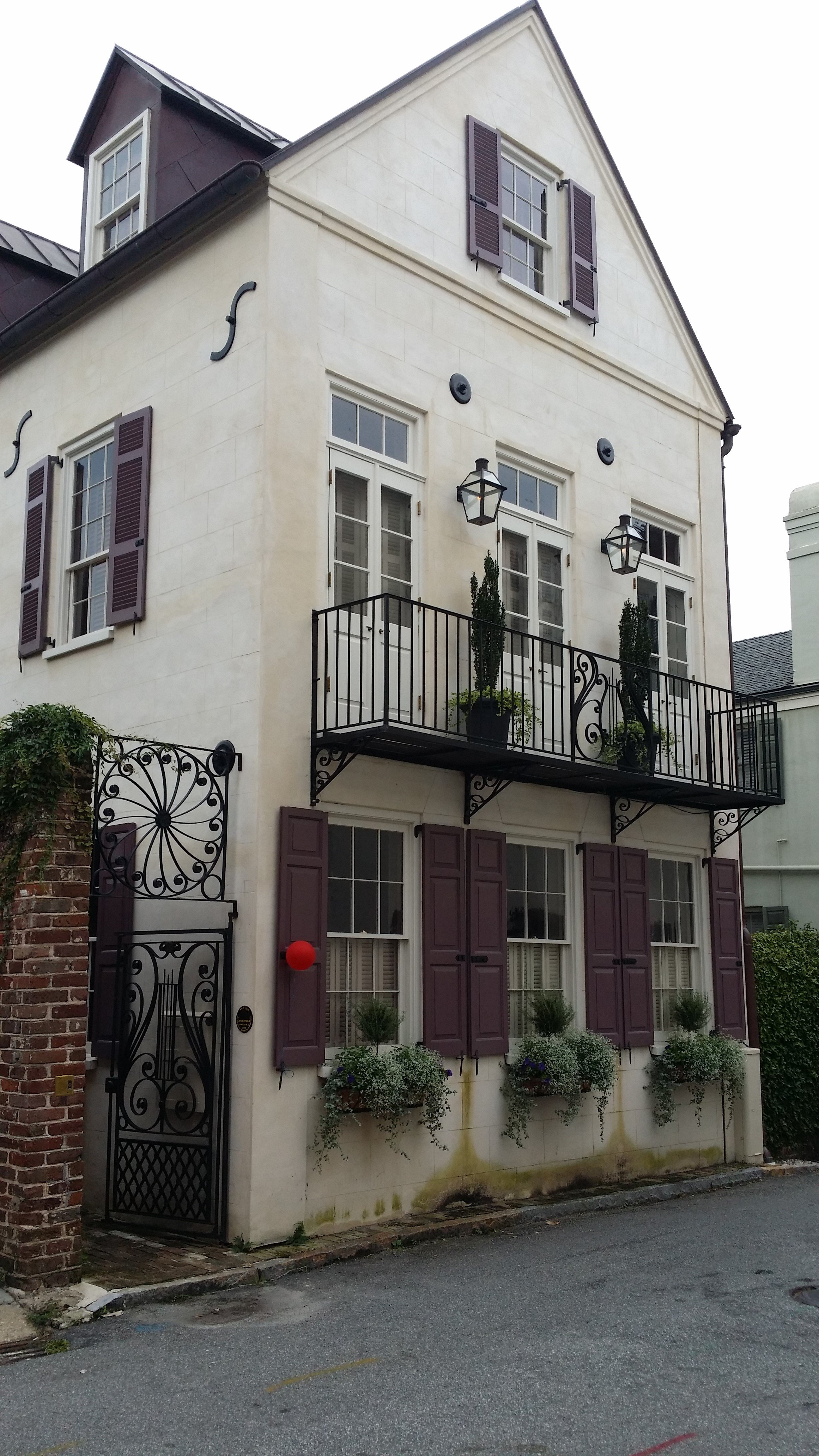
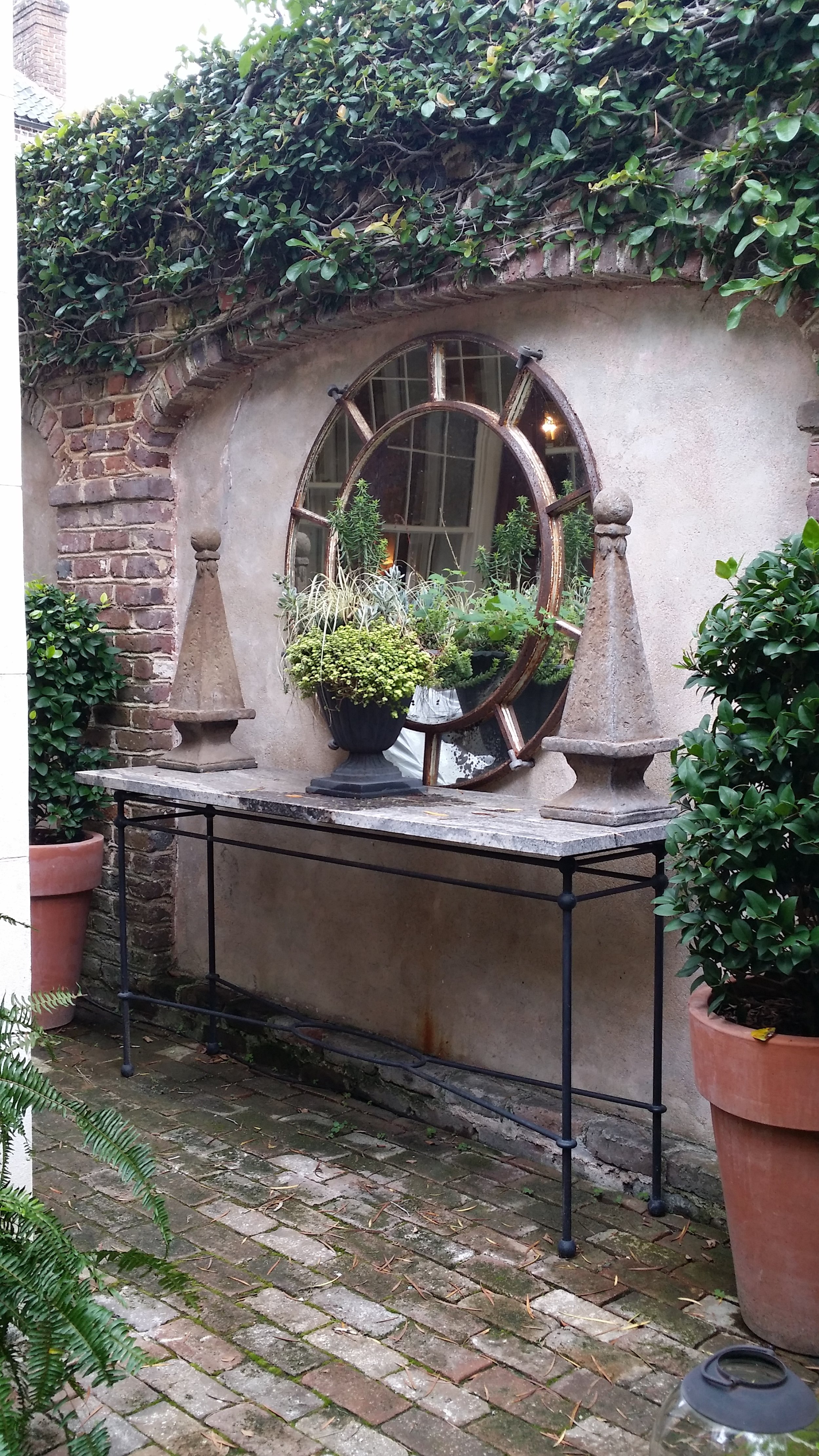
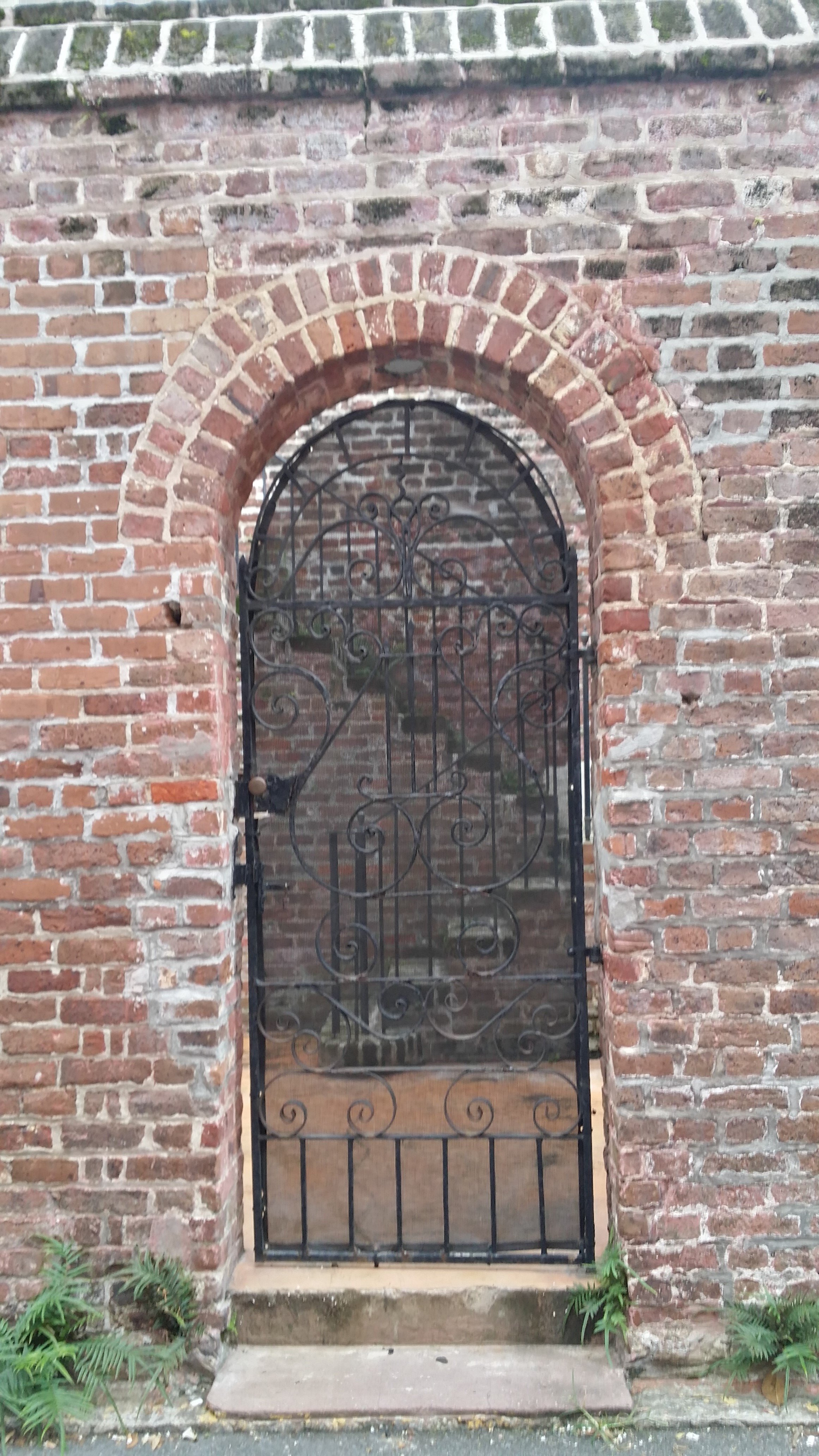
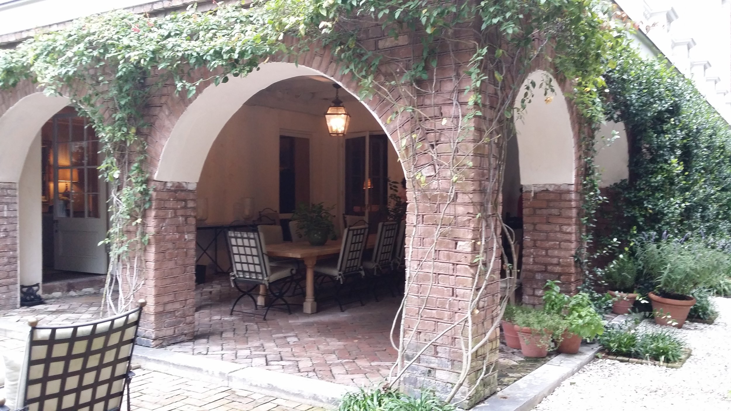
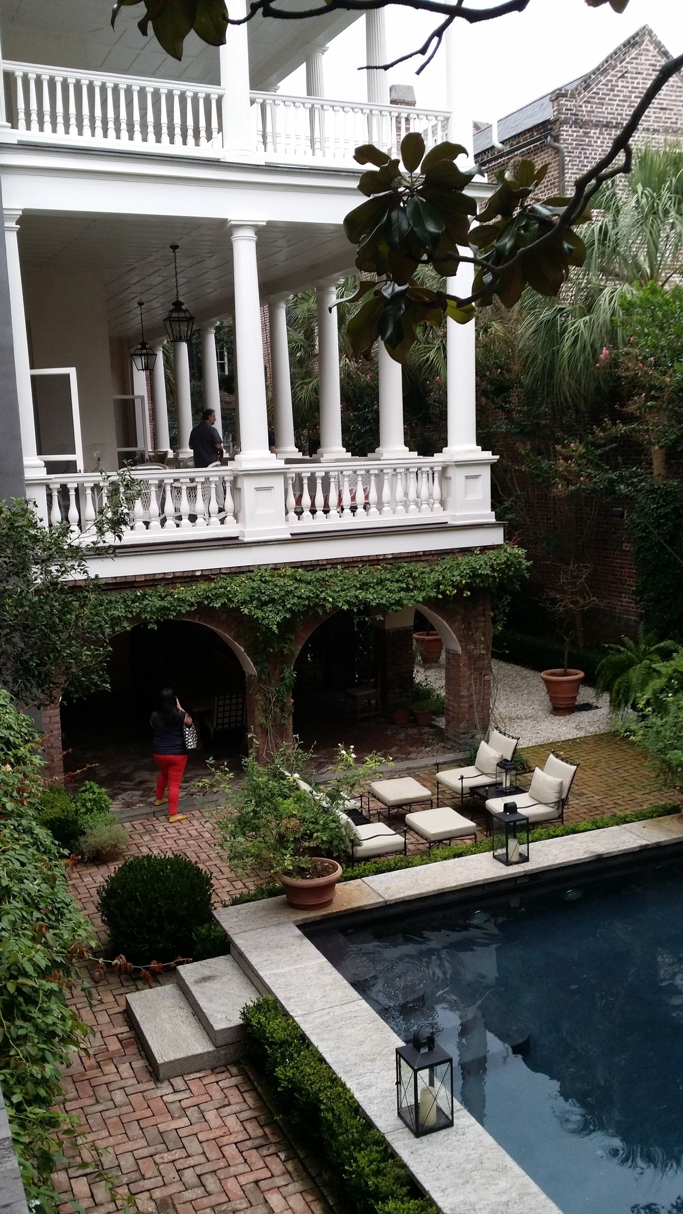
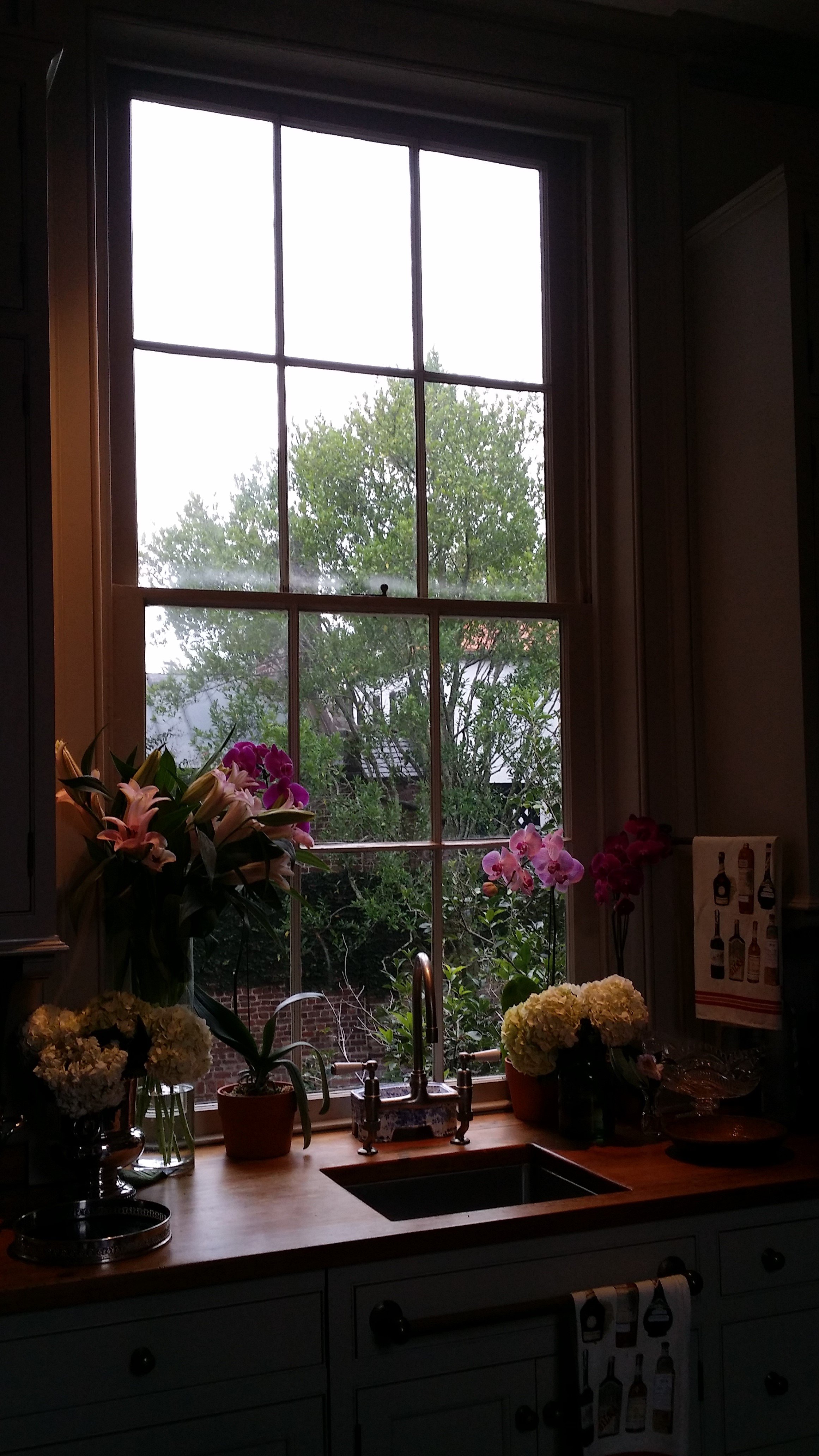
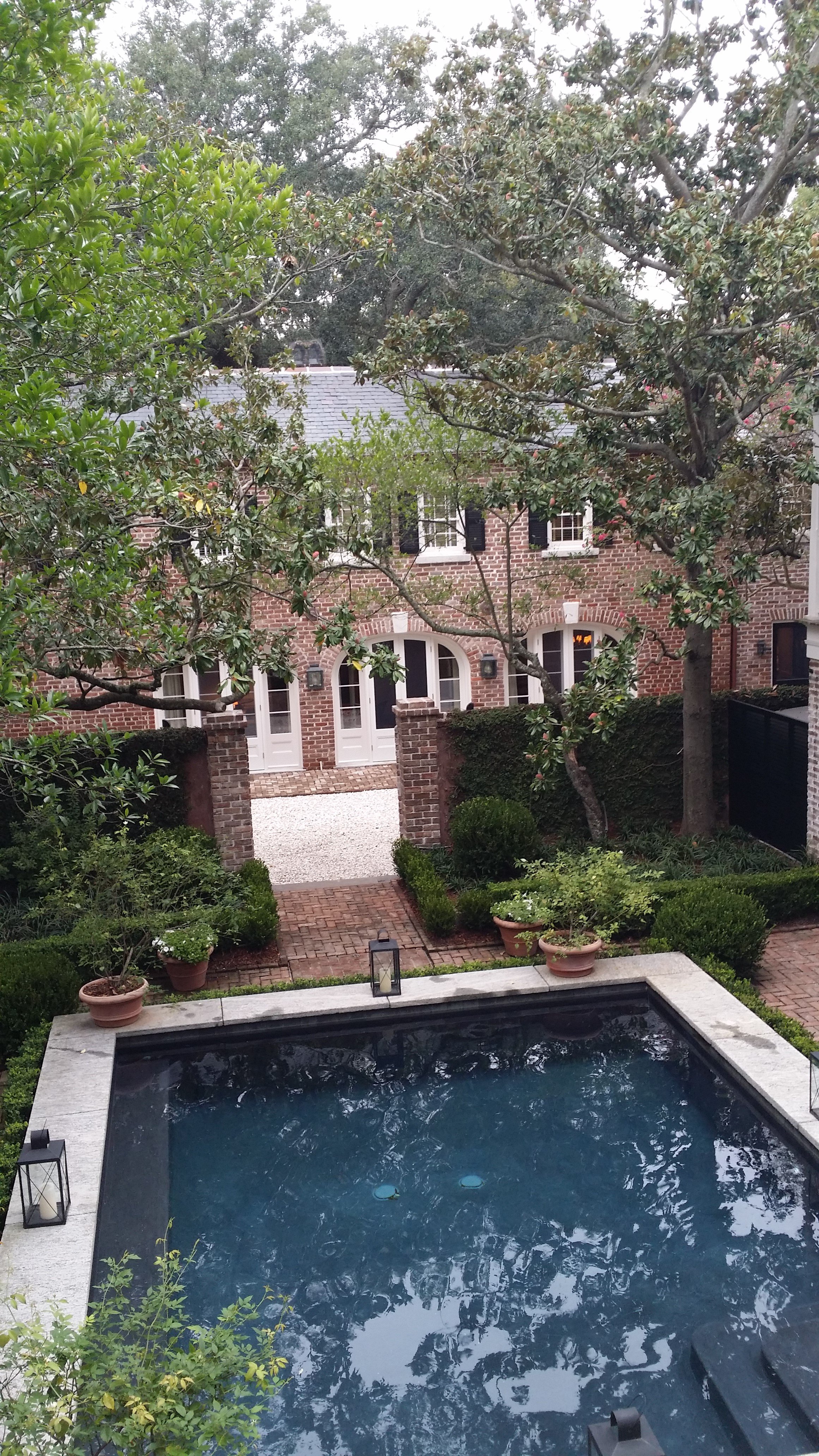
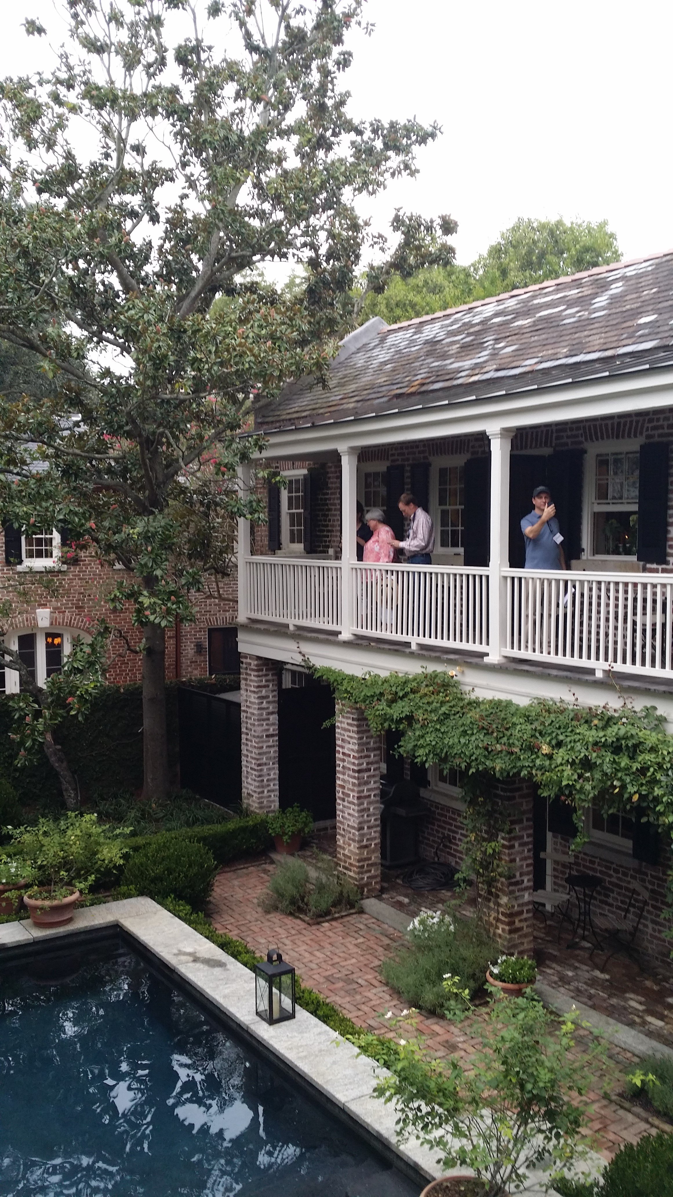
The walking tour of four houses (pictured below) in downtown Charleston was an excellent way to experience the city and appreciate architectural details that lend to the charm of the city - the courtyards, gardens, and south facing side porches, the decorative iron gates, gas lanterns, and window shutters, the variety of materials and colors, the weathered age and imperfection.

It was inspiring to see the work presented by architects and be part of the stirring dialogues that followed.  Particularly refreshing was the work of Khoury & Vogt Architects in Alys Beach, Florida (I wanna go there!).  Traditional style of design held the floor one afternoon, and modernist another.  The debate of architectural style was put to rest, somewhat, when Architect Julie Snow said, "the question of traditional vs. modern is a red herring. There is good architecture, and there's bad".  I couldn't agree more.

I really enjoyed the lively keynote address by new urbanist Andres Duany, but frankly speaking, I could have lived with fewer lectures.  A few were engaging, but many were a little too dry and academic for my liking.  I like to indulge in intellectual discourse just as much as the next person, but for afternoon sessions, they were long and one too many.   I wish instead, there was some discussion about matters such as how architects can shape and influence public opinion about architecture, or the role and value of historic preservation efforts, or any number of other relevant topics.

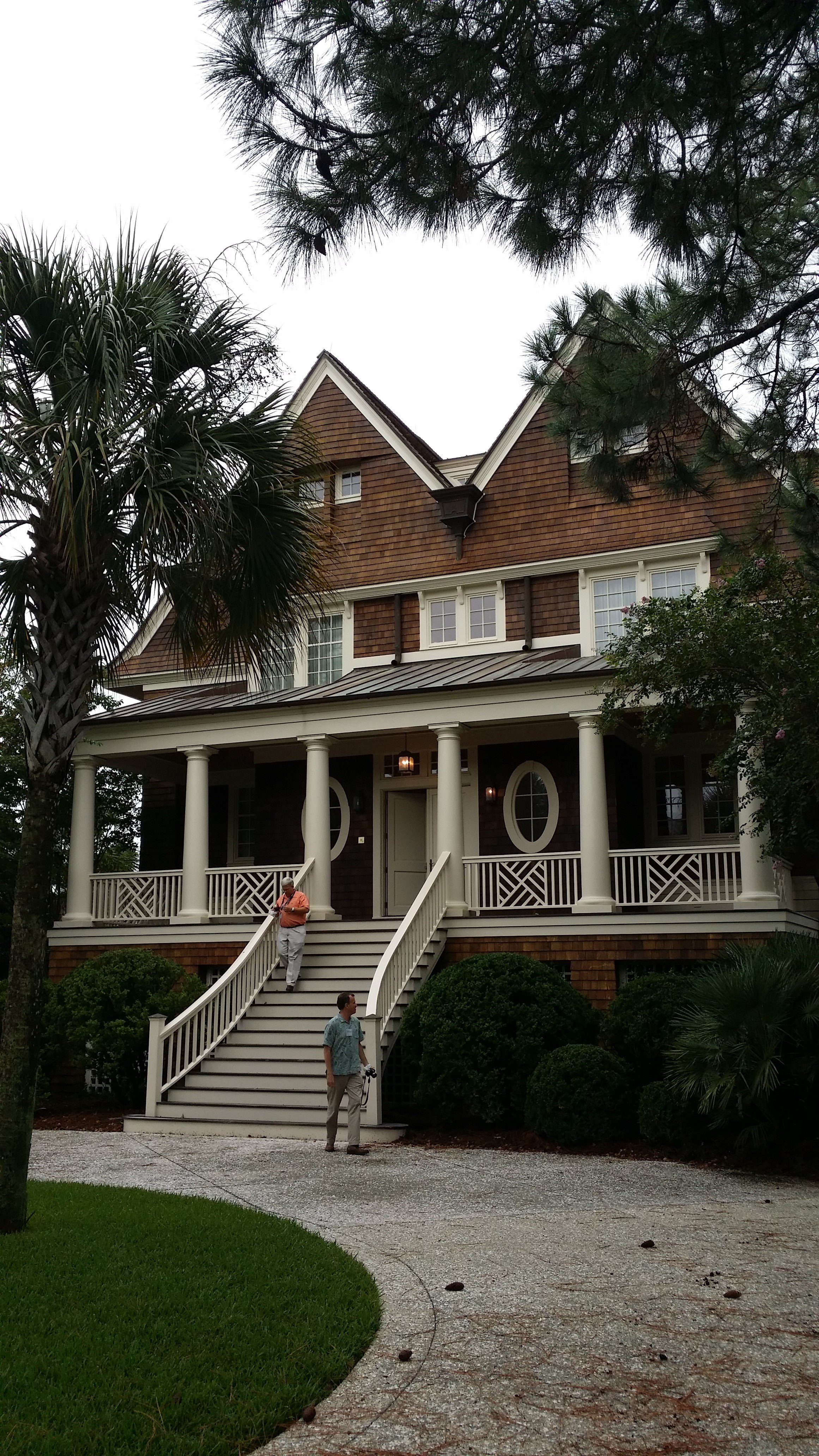
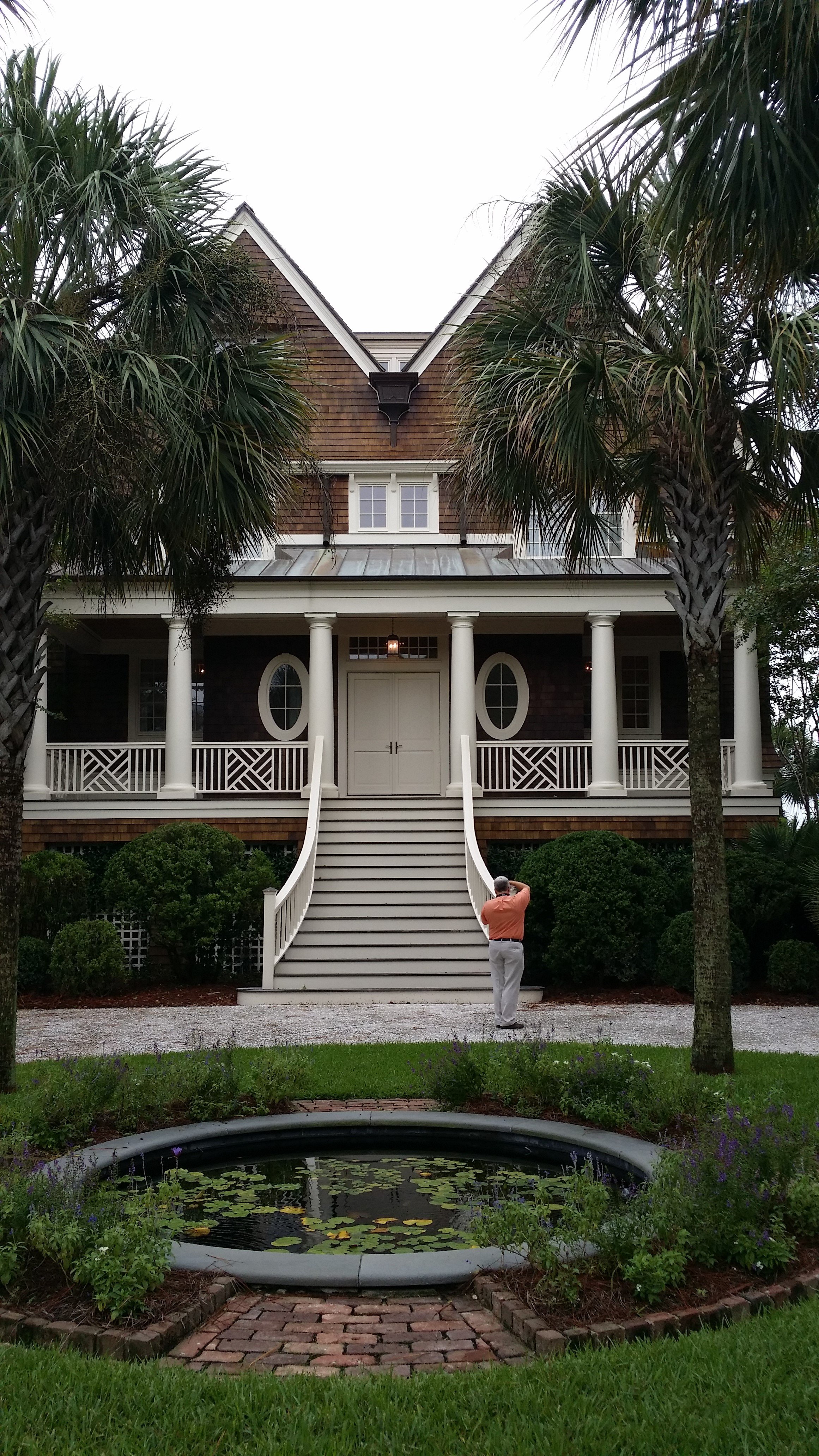
On the last morning, we toured four houses (pictures below), including the historic Vanderhost plantation, and the ocean course clubhouse (designed by Robert A.M. Stern Architects) on Kiawah Island, a private barrier island surrounded by the ocean and salt marshes, known for its golf courses and mansions.  Respect for nature takes a whole new meaning when you have to design a building set in a delicate ecosystem that supports abundant wildlife, challenging soil conditions, lowcountry coastal climate, and flooding.  Not to mention, the Architectural Review Board design and construction guidelines are 80 pages long.

I'll admit these are not great photographs, as they were taken in a hurry with my phone.  The Kiawah tour particularly was very rushed.  But, I'll upload more pictures in a separate post shortly.

Also, got myself a copy of the book that CRAN released - Houses for All Regions CRAN Residential Collection.

Cheers,

Sharon.
View into Jeld-Wen

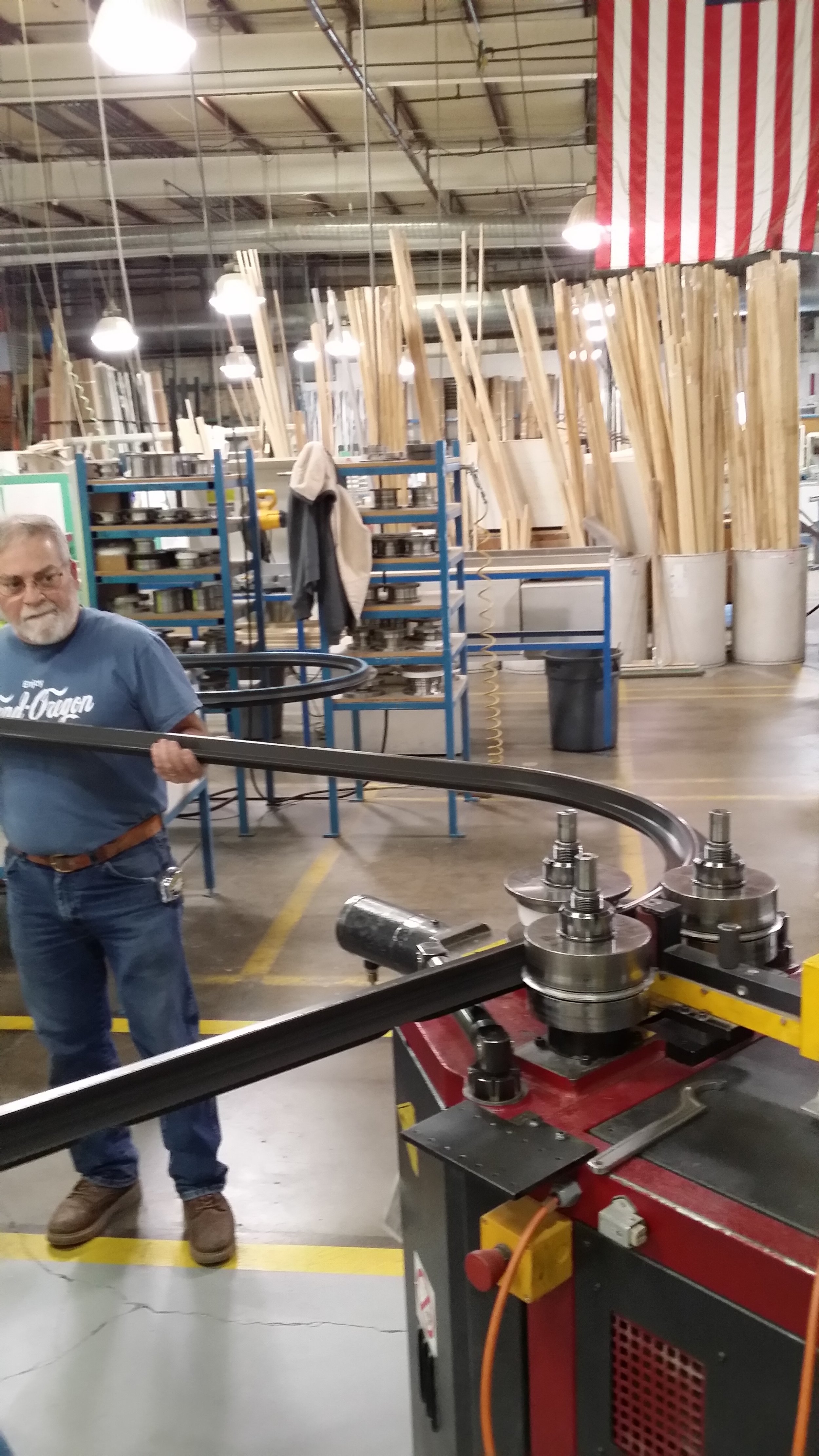
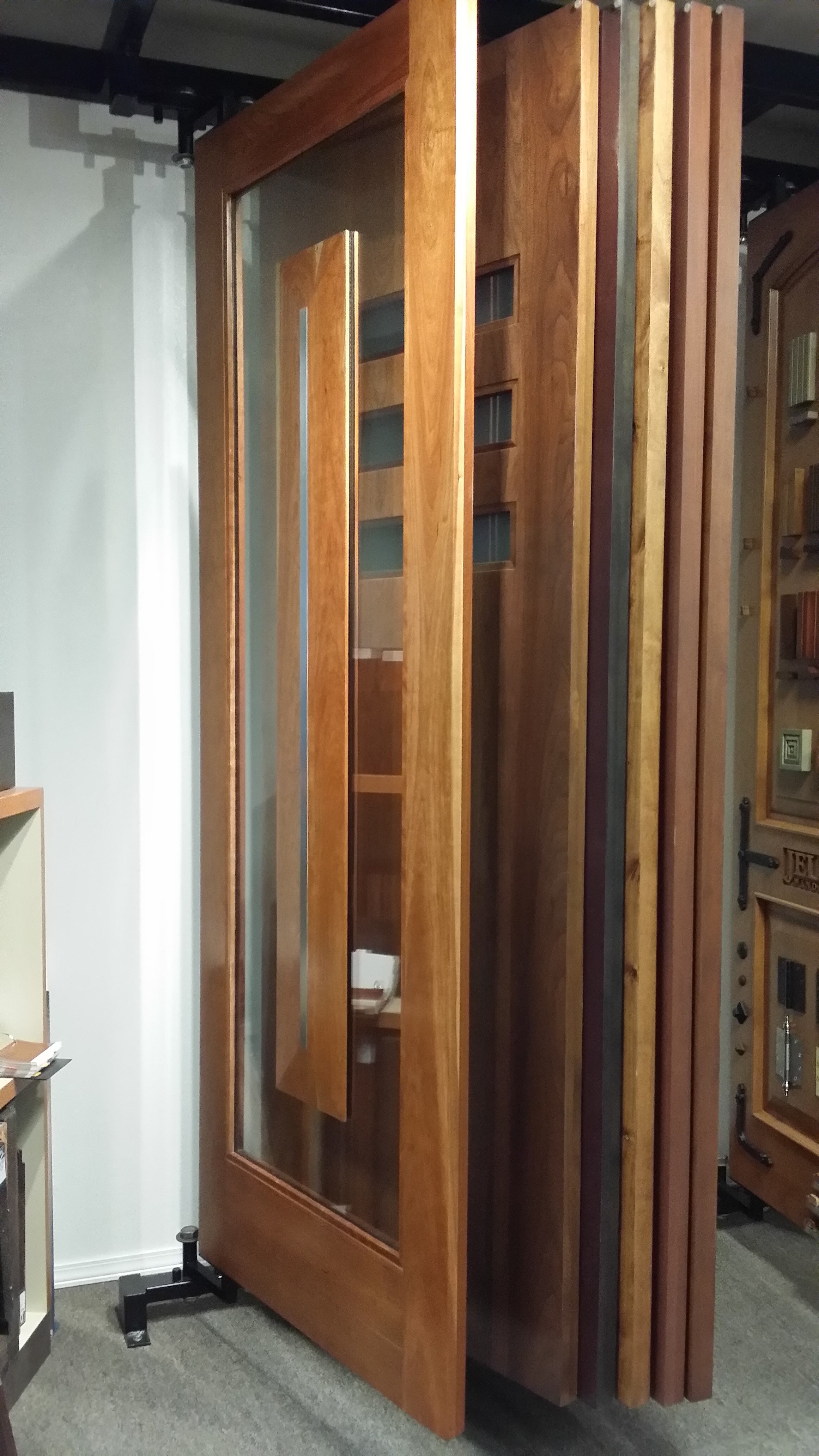
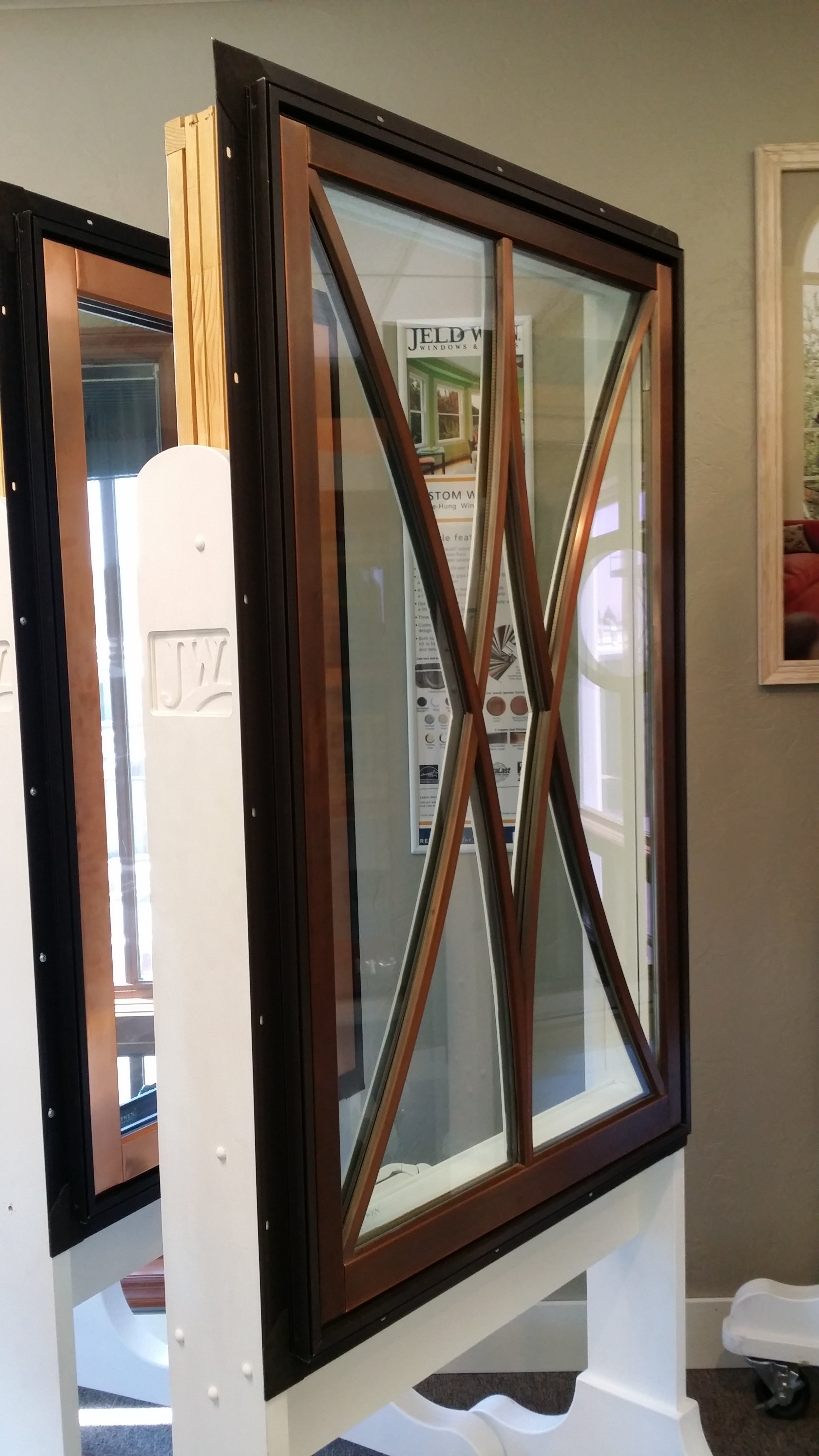
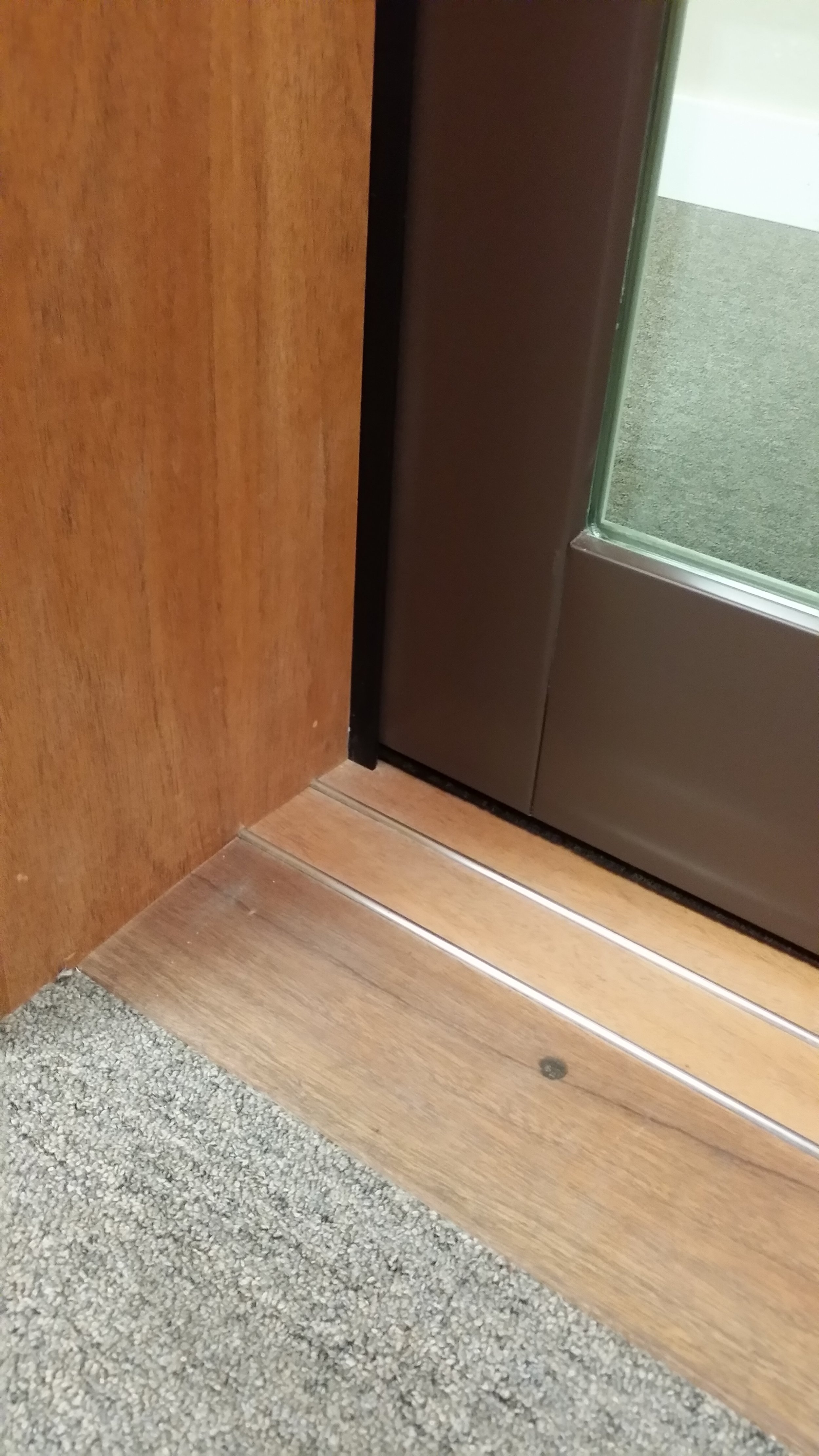
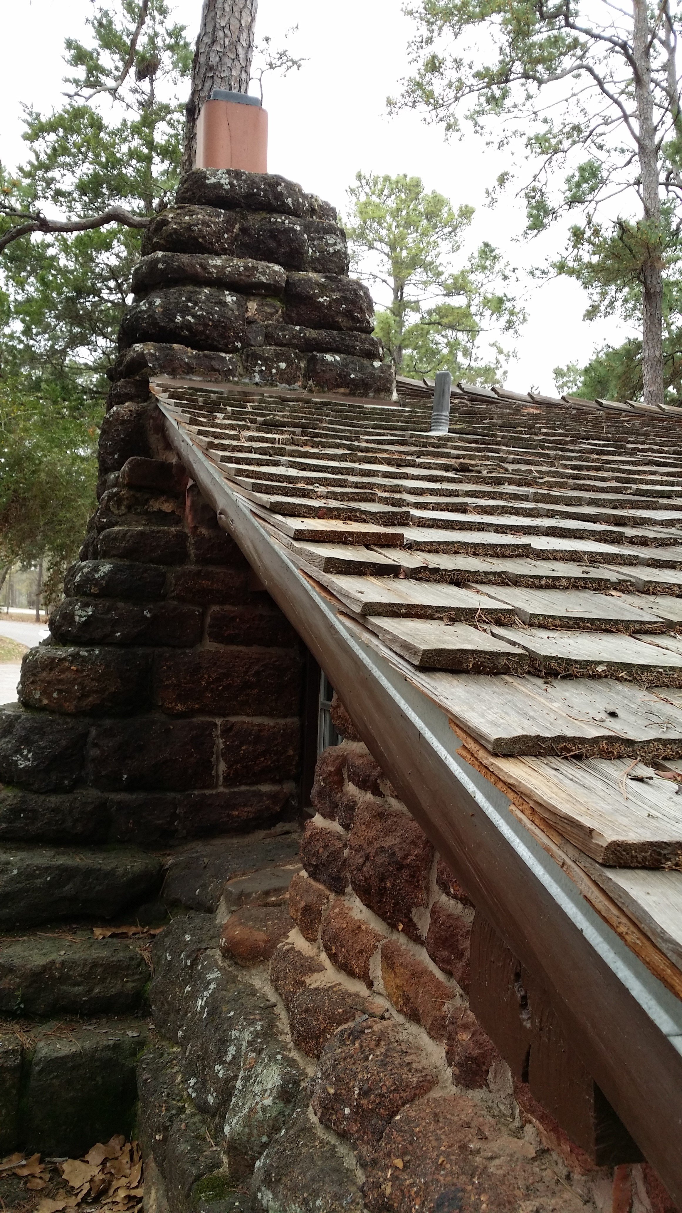
I was invited to tour the Jeld-Wen plant in beautiful Bend, Oregon, which is where they manufacture their custom series of wood and aluminum clad-wood doors and windows.  This used to be the Pozzi window company since 1978 before Jeld-Wen bought it in 1992. As an architect, this factory tour and their spiel was particularly inspiring because they showcased many custom designs and talked about their capabilities that compete with really high-end wood window manufacturers like Marvin or Kolbe-Kolbe.  I was also very excited to see innovation in a 100-year-old industry and a can-do attitude. Having toured the Andersen window plant in Stillwater, Minnesota many years ago, I knew what to expect and could immediately see some similarities.  As at any manufacturing facility, work flow efficiency and quality control are stressed upon; all the moving and heavy lifting is handled by machinery; measuring and cutting is computerized. One would think that a lot of the repetitive tasks involved in putting the windows together are automated, but not so!  Window assembly is a labor intensive process. I was surprised to see that many of the parts are put together manually - men and women working with hand-held tools. From cladding the wood frame to joining the window frames together, from sealing the glass in the sash to setting the sash in the frame, how many hands touch one window before it is ready to ship, I'm sure they have the numbers. Perhaps because this is a much smaller facility and most windows are custom sizes and shapes, a Jeld-Wen veteran checks each and every window at the end of assembly.

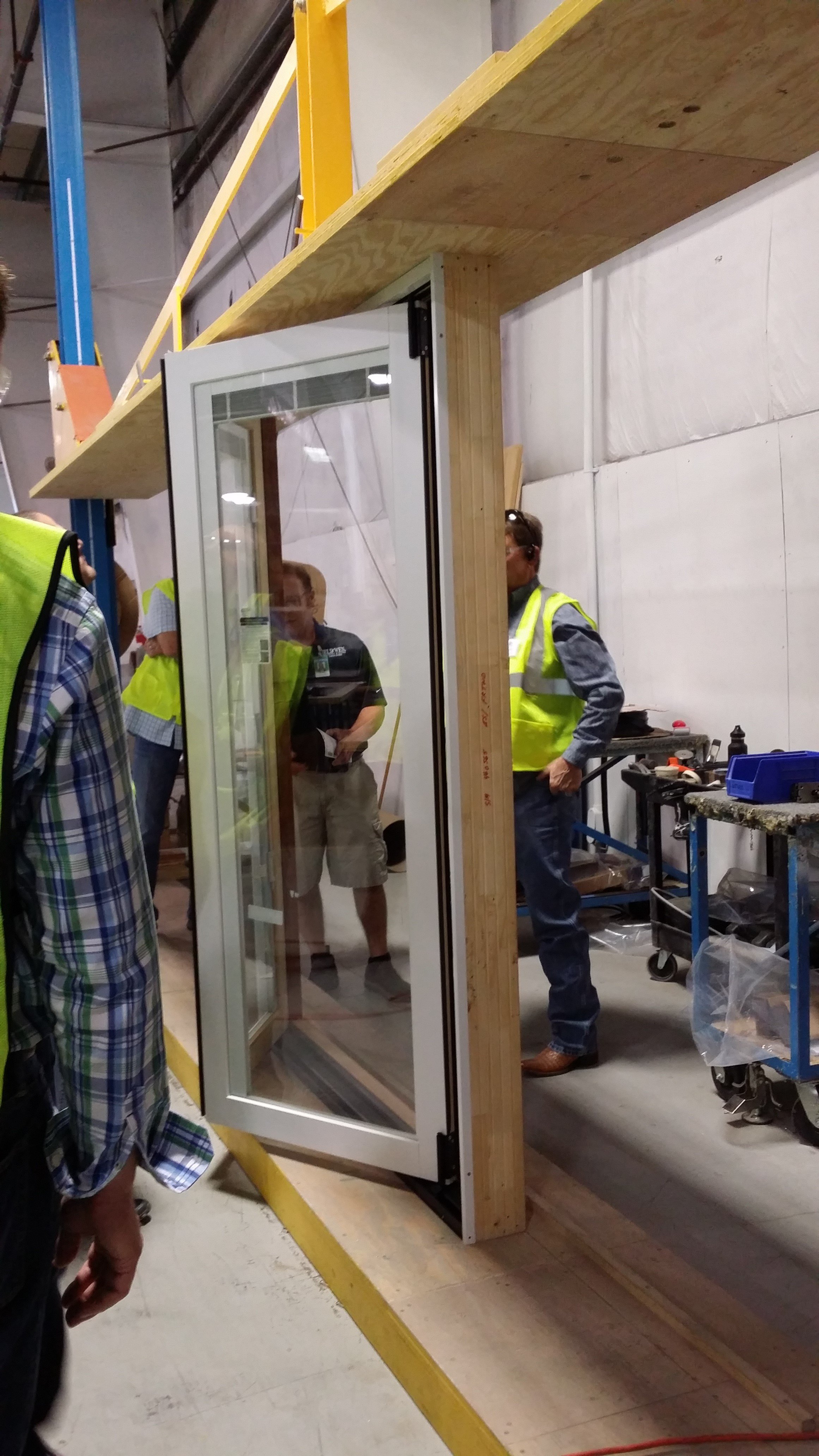
It was also interesting to witness the testing performed on the windows and doors. A window/ door was installed in a sealed chamber that simulated real-world conditions like wind-driven rain to verify the unit's performance, and check on status of the weather-stripping, joints, etc.

Much like other wood window and door manufacturers, Jeld-Wen started as small mill-work company in 1960 in Klamath Falls, Oregon where timber harvesting was booming. They have since grown to be one of the top, holding a large market share in a very competitive industry, offering a diversified portfolio of products that cater to various budgets.

My personal experience is only with the Jeld-Wen Siteline EX aluminum clad-wood series, mostly casements and fixed windows.  I would be loath to specify a window with wood on the exterior, but that's easy for me since I don't do historic preservation type projects. Wood on the exterior of a window is just asking for trouble, even if it is treated wood such as Jeld-wen's proprietary AuroLast wood.  I also only specify windows with an integral nailing fin, so that it installed and flashed according to best building practices.  Anybody who installs a window using a "block frame" so that they "don't have to disturb" existing exterior finish such as siding, stucco, or stone, knows nothing about infiltration and water management in building envelope. If you ask me, they should not even be selling this option.

Jeld-wen offers many features and options that let you customize their product for a sophisticated client - upgrades in glass (they buy from Cardinal Glass), screens (Phantom Screens), finishes (pre-finish options, wood species, exterior colors, kynar finish, etc).  But if you are looking for a window of an unusual size or shape with unique features, I think you will find that the custom Jeld-wen plant in Bend, Oregon will not disappoint.  They look at your request, and the design team will meet to review, do research, and get back to you with an answer. It could cost you a lot, but if there is a way to do it, they will build it.  They make a prototype of every unique window, test it in-house for wind pressure, water and air infiltration.

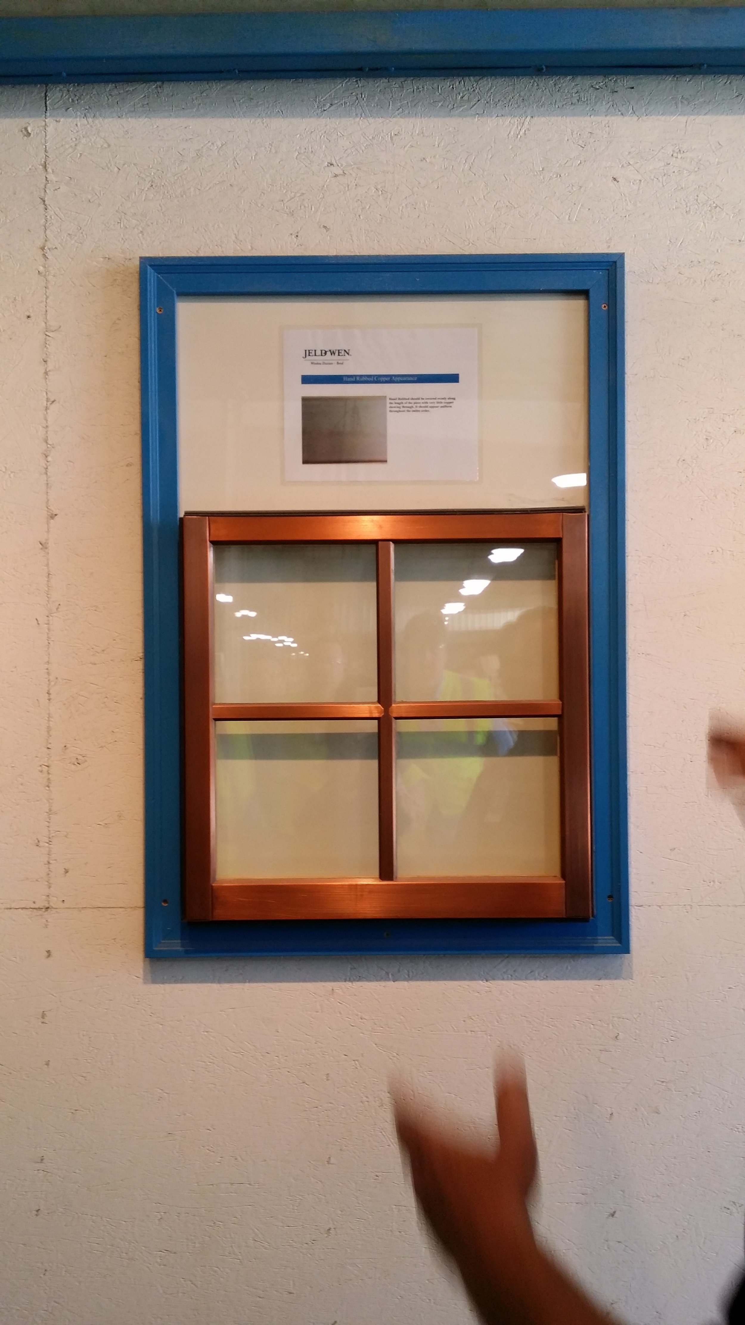
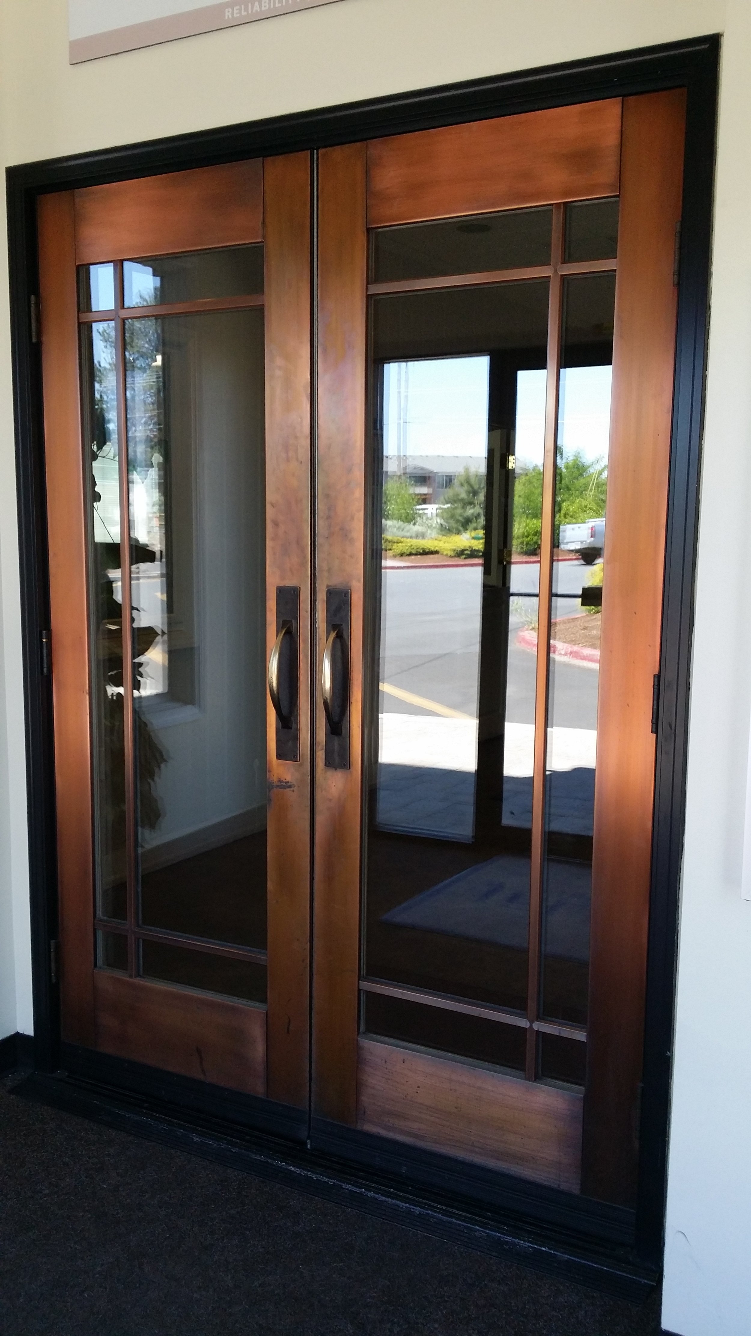
The highlight for me was the curved glass windows and the copper clad windows.  They can clad the sash with copper but since it is a roll-formed product (not extruded like aluminum) it cannot be used on the (structural) frame of the window.  They had several examples with black aluminum frames and copper sashes, which looked pretty neat.  Keep in mind that copper is a living finish, and will patina over time, the end result being different from New York to Austin.  I have a love affair with vertical grain Douglas Fir (something about all the grain lines aligned so tightly makes my heart sing) and copper.  My eyes got to feast on many examples of both materials.

Other products I was excited to see were the large-opening folding window and door systems - 4 panel bi-parting doors, multi-slide stackable pocket doors, zero-corner doors.  If money is no object, then the options start to open up, no pun intended.

I firmly believe that innovation at the customizable (uppermost) level trickles down to the mass market as demand will drive the cost down. What is expensive and high-end today, will become commonplace tomorrow.  What was considered luxury yesterday is a standard today.  We've seen it in the food industry, the car industry, all types of technology, and the building industry is certainly no exception.

Cheers,

Sharon George.

AIA CRAN Symposium - The Architecture of Influence (Copy)

I have just returned from Charleston, South Carolina where I attended the 2014 symposium of The American Institute of Architects Custom Residential Architects Network (AIA CRAN). Wow, that's a mouthful!  If you work in or run a residential practice, this is the part of the AIA that you need to follow and be involved with. I was excited about this symposium for three reasons. Firstly, I was looking forward to going back to Charleston and spending some time in the historic city, because the first time I was there, I spent most of my time on the beach.  Secondly, this was going to be my first time at a CRAN symposium and I had heard great things about the ones in the past, especially the home-tours.  Lastly, and most importantly, the theme: "The Architecture of Influence" - you cannot tell me that does not sound inviting to a bunch of architects.  Charleston was the perfect backdrop to explore this aspect of residential architecture.

"“The Architecture of Influence” will explore the importance of history and context in the design of new houses, and in particular how the careful consideration of historical architectural styles – both traditional and Modernist – can help architects design houses that contribute to established physical and cultural settings. How a new house or building looks is fundamental to how a community responds to it, and this symposium is intended to encourage an ongoing conversation about what it means to design a good architectural neighbor in the 21st century."

The walking tour of four houses (pictured below) in downtown Charleston was an excellent way to experience the city and appreciate architectural details that lend to the charm of the city - the courtyards, gardens, and south facing side porches, the decorative iron gates, gas lanterns, and window shutters, the variety of materials and colors, the weathered age and imperfection.

It was inspiring to see the work presented by architects and be part of the stirring dialogues that followed.  Particularly refreshing was the work of Khoury & Vogt Architects in Alys Beach, Florida (I wanna go there!).  Traditional style of design held the floor one afternoon, and modernist another.  The debate of architectural style was put to rest, somewhat, when Architect Julie Snow said, "the question of traditional vs. modern is a red herring. There is good architecture, and there's bad".  I couldn't agree more.

I really enjoyed the lively keynote address by new urbanist Andres Duany, but frankly speaking, I could have lived with fewer lectures.  A few were engaging, but many were a little too dry and academic for my liking.  I like to indulge in intellectual discourse just as much as the next person, but for afternoon sessions, they were long and one too many.   I wish instead, there was some discussion about matters such as how architects can shape and influence public opinion about architecture, or the role and value of historic preservation efforts, or any number of other relevant topics.

On the last morning, we toured four houses (pictures below), including the historic Vanderhost plantation, and the ocean course clubhouse (designed by Robert A.M. Stern Architects) on Kiawah Island, a private barrier island surrounded by the ocean and salt marshes, known for its golf courses and mansions.  Respect for nature takes a whole new meaning when you have to design a building set in a delicate ecosystem that supports abundant wildlife, challenging soil conditions, lowcountry coastal climate, and flooding.  Not to mention, the Architectural Review Board design and construction guidelines are 80 pages long.

I'll admit these are not great photographs, as they were taken in a hurry with my phone.  The Kiawah tour particularly was very rushed.  But, I'll upload more pictures in a separate post shortly.

Also, got myself a copy of the book that CRAN released - Houses for All Regions CRAN Residential Collection.

Cheers,

Sharon.